Logo Design Wordmarks & Marks · Concept Exploration · Canva
01
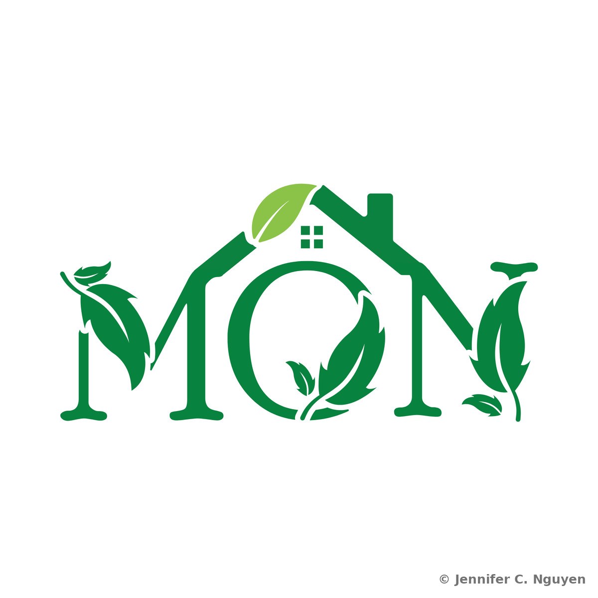
Mon Cafe Logo

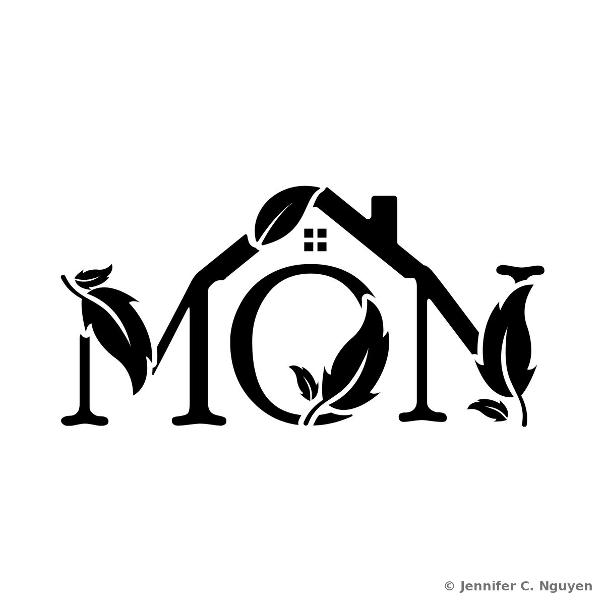
A warm, leaf-inspired wordmark for Mon Cafe, where the letterform doubles as a cozy little house, evoking home, comfort, and the ritual of a good cup of tea. Developed across black, white, and full-color variants to move seamlessly from signage to packaging to menu design.

WordmarkCafe BrandingColor Variants
The Mon Cafe wordmark logo in forest green on a white background, with the single leaf on the rooftop rendered in a lighter, contrasting greenPrimary Mark — green wordmark with light green leaf accent
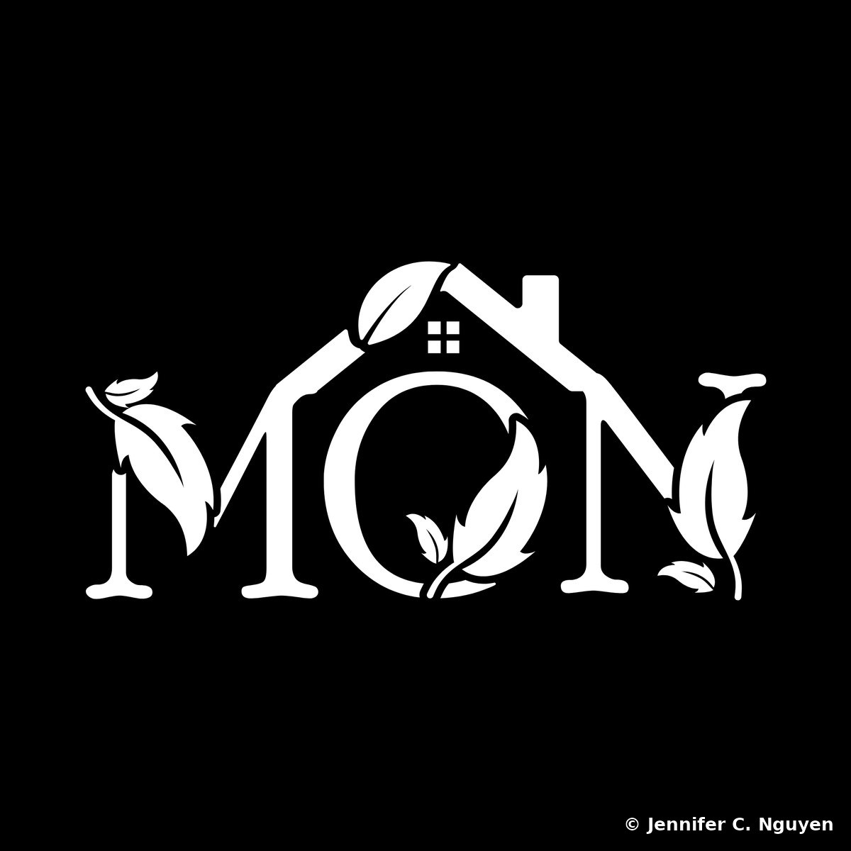
The same Mon Cafe house-and-leaf wordmark logo reversed out in white on a solid black backgroundReversed Mark — white wordmark on black
Mon Cafe wordmark logo in black on a white background, combining the letters M O N into one mark where the O is shaped like a small house with a peaked roof, chimney, and four-pane window, with hand-drawn leaf illustrations sprouting from the M and N and a single leaf tucked into the rooflineBlack Mark — black wordmark on white
The Mon Cafe house-and-leaf wordmark logo in white, reversed out on a solid forest green backgroundWhite Mark — white wordmark on green
02
The Phantoms Motorcycle Club, Logo Concepts

A sample from 47 logo directions developed for a motorcycle club rebrand pitch, spanning photorealistic bike renderings, neon and chrome concepts, and a full cast of colorful character mascots. The club wanted a mark strong enough to put on hoodies that members could wear as a group at rides and meetups, so range mattered as much as polish; the goal was finding the one identity that felt unmistakably theirs.

Concept ExplorationCharacter DesignApparel Mockups
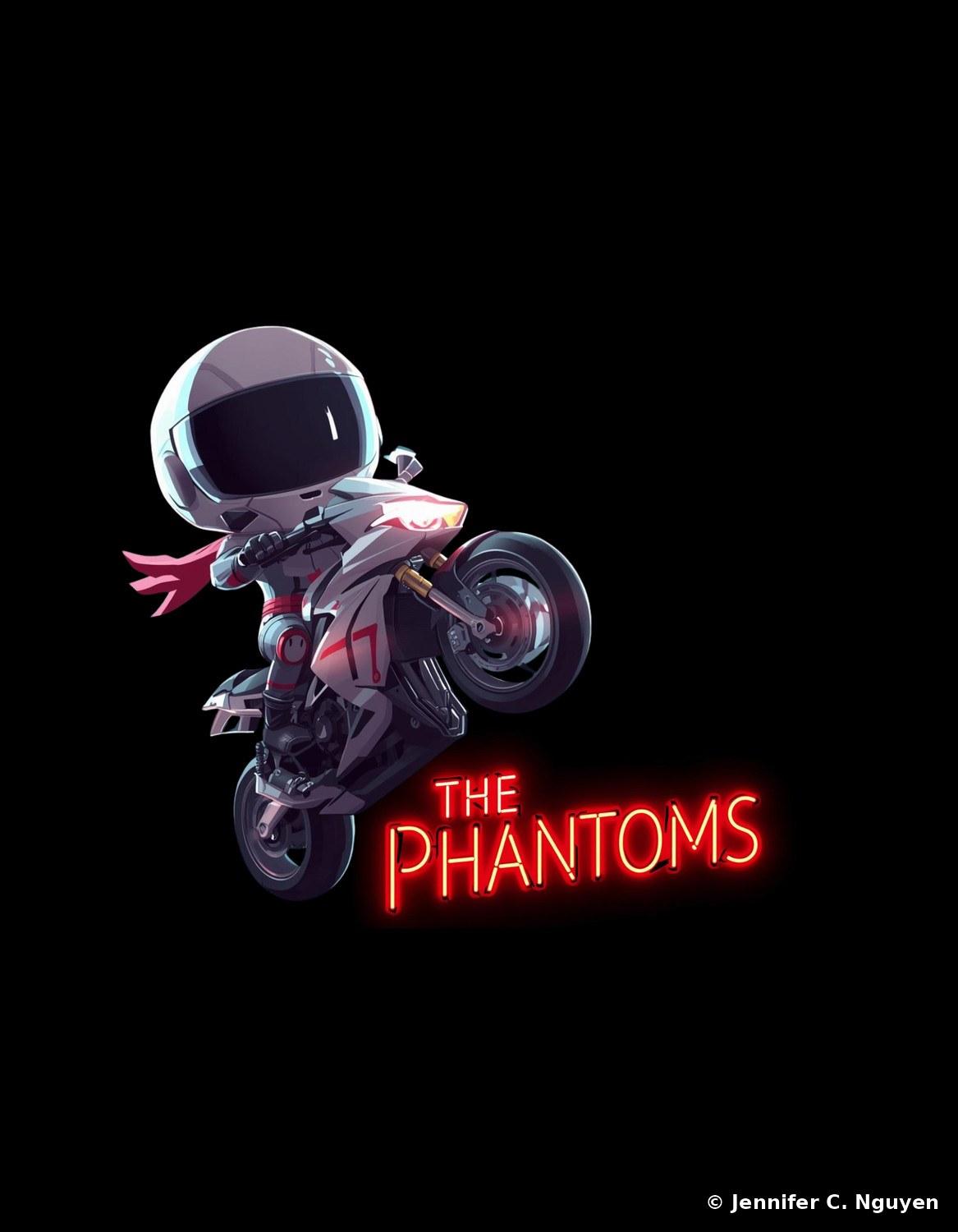
A colorful chibi astronaut-helmeted racer mascot popping a wheelie on a white and red motorcycle with a pink scarf trailing behind, 'THE PHANTOMS' rendered as a glowing red neon sign beside itRacer Mascot — neon sign lettering
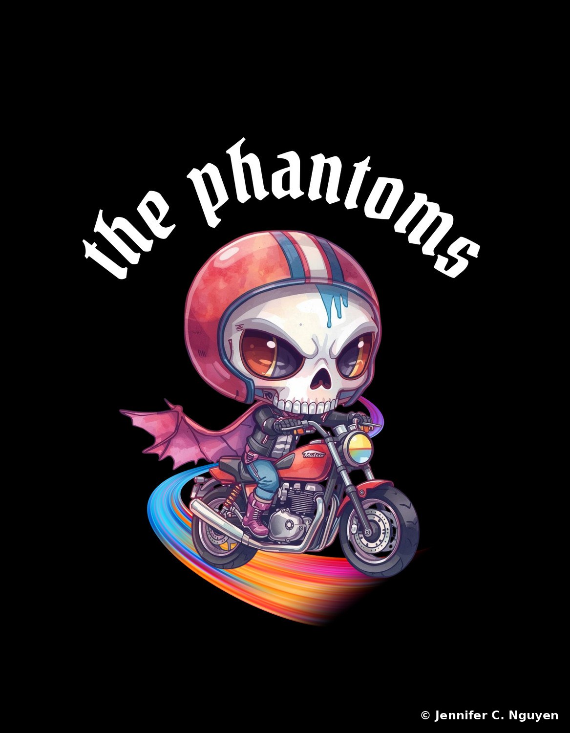
A colorful chibi skeleton mascot wearing a red and blue striped helmet and pink bat wings, riding a red motorcycle along a rainbow-colored speed trail, with 'the phantoms' in white gothic script aboveCharacter Mascot — winged skeleton rider
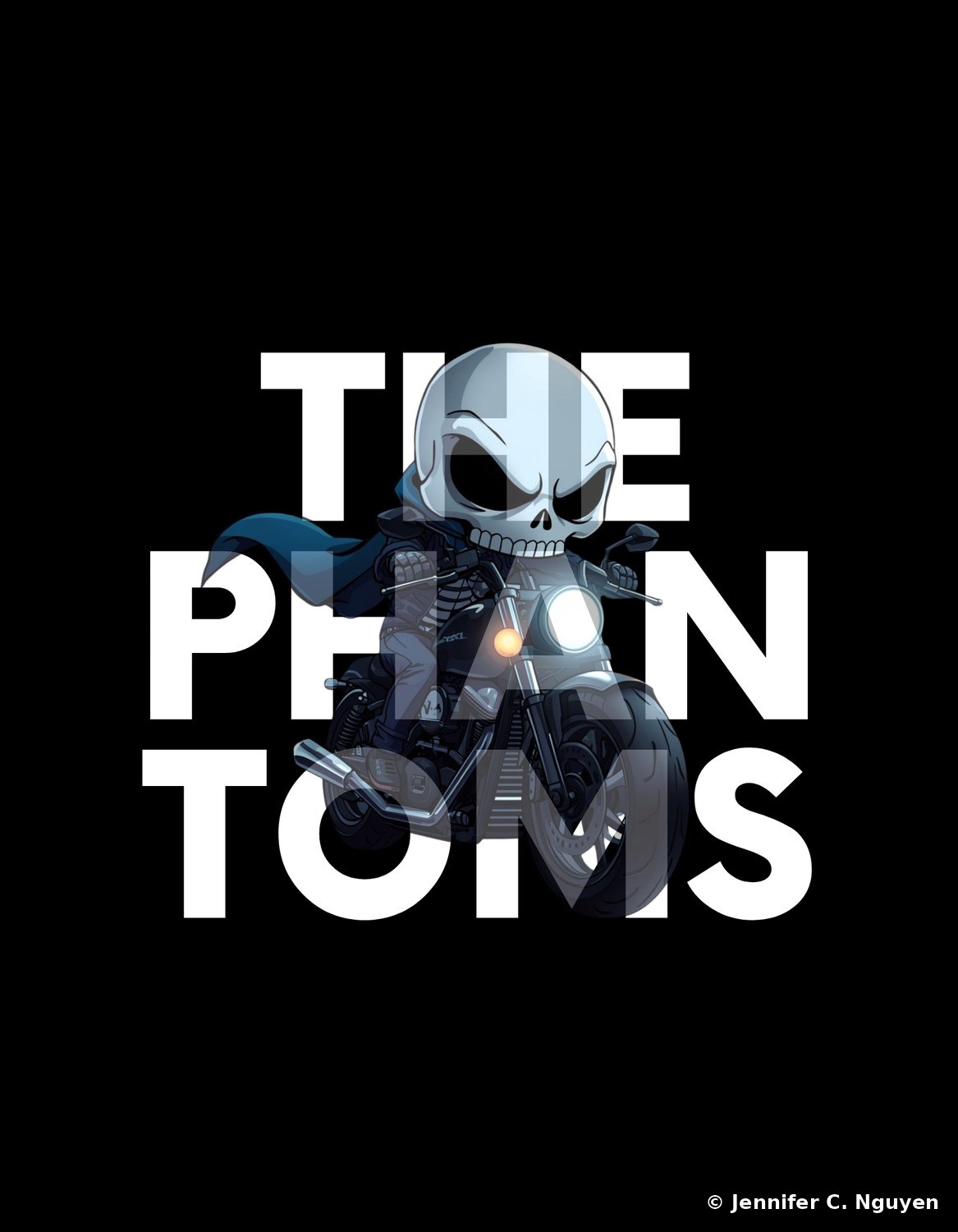
A dark chibi skeleton mascot with a blue hooded cloak riding a black motorcycle with a glowing white headlight, oversized ghosted 'THE PHANTOMS' lettering layered behind the character in the backgroundCharacter Mascot — ghosted lettering treatment
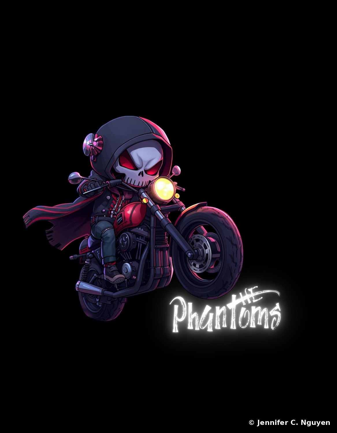
A dark chibi skeleton mascot with glowing red eyes wearing a hooded black and red racing jacket and helmet, riding a red and black motorcycle, with 'THE Phantoms' in glowing white brush letteringCharacter Mascot — hooded skull rider
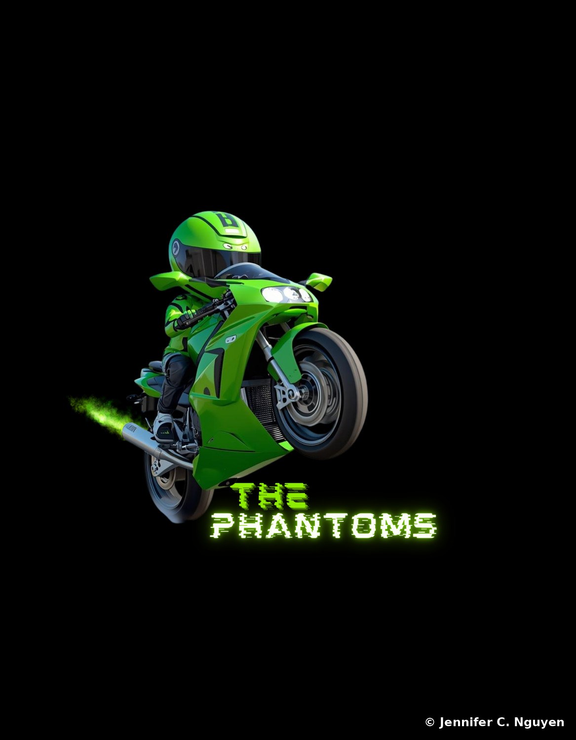
A photorealistic rendering of a green sportbike popping a wheelie with its rider in matching green racing leathers, a green exhaust flame trail behind, and 'THE PHANTOMS' in glitch-style green and white letteringPhotoreal Concept — green sportbike wheelie
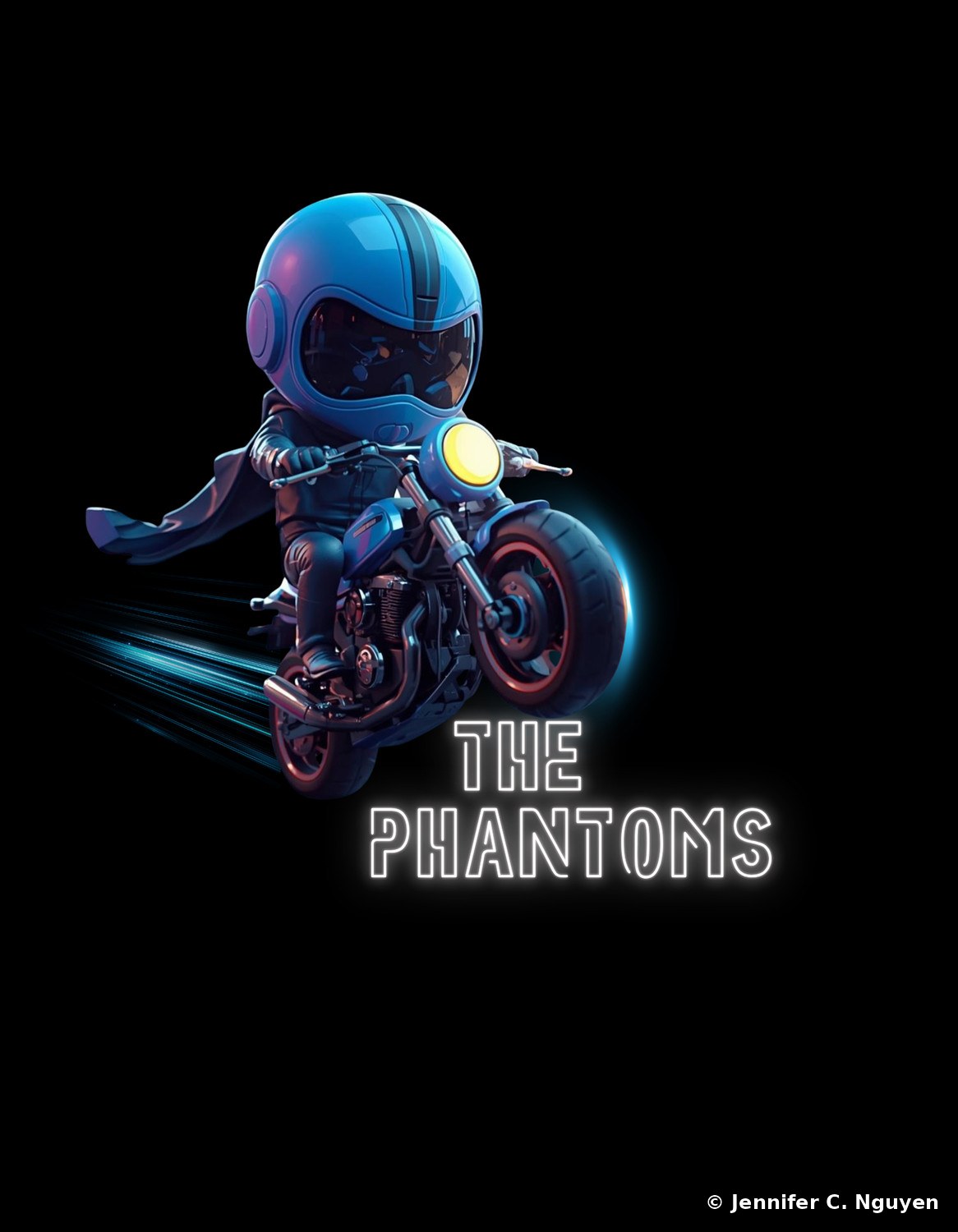
A chrome and blue chibi mascot rider in a glossy blue helmet and flowing cape on a dark motorcycle with glowing blue speed lines, 'THE PHANTOMS' in blue neon outline lettering belowNeon Concept — chrome and blue rider
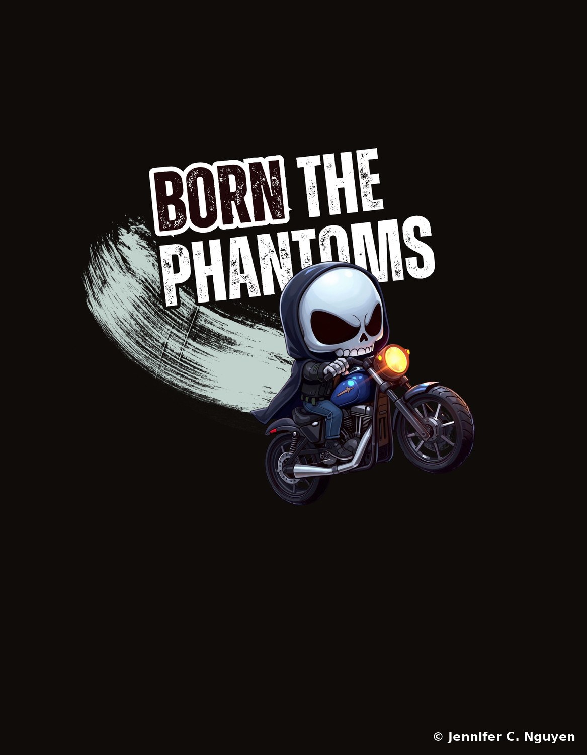
A small hooded skeleton mascot in a dark cloak riding a blue chopper-style motorcycle with a glowing headlight, a light gray paint-swipe graphic and 'BORN THE PHANTOMS' distressed lettering aboveCharacter Mascot — hooded grim reaper rider
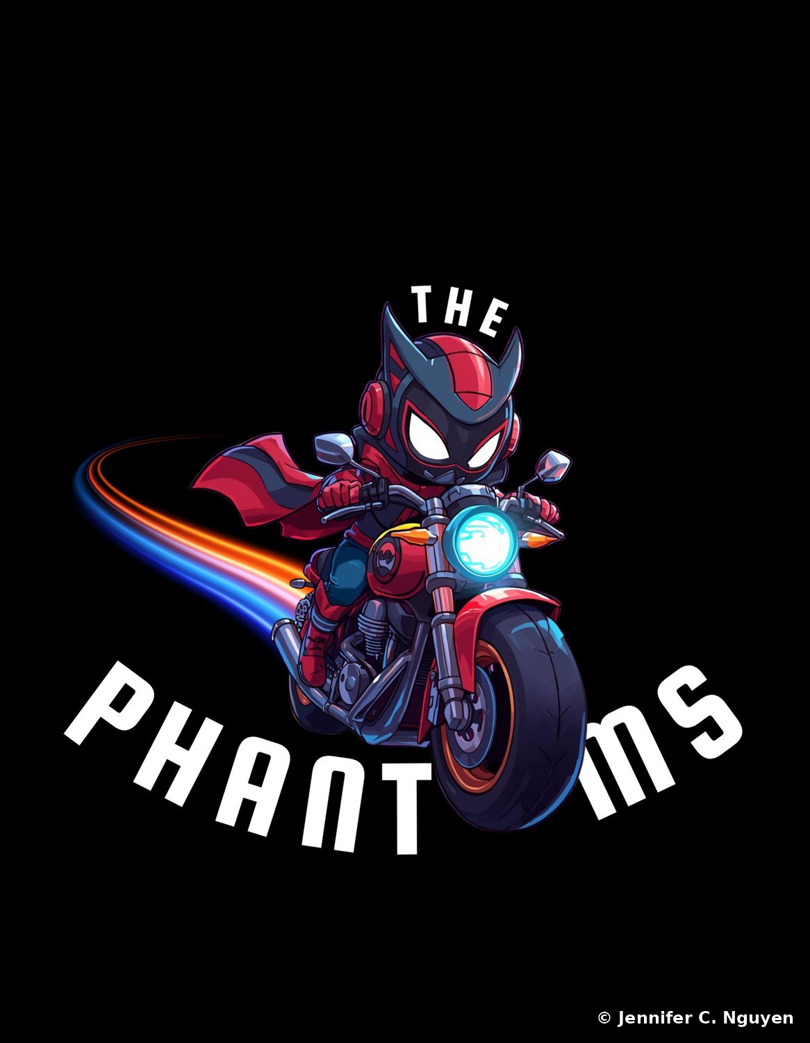
A red and black chibi mascot rider with cat-like ear fins on its helmet and glowing white eyes, riding a red motorcycle with a blue and orange light trail, 'THE PHANT...MS' lettering arched around the characterCharacter Mascot — cat-eared ninja rider
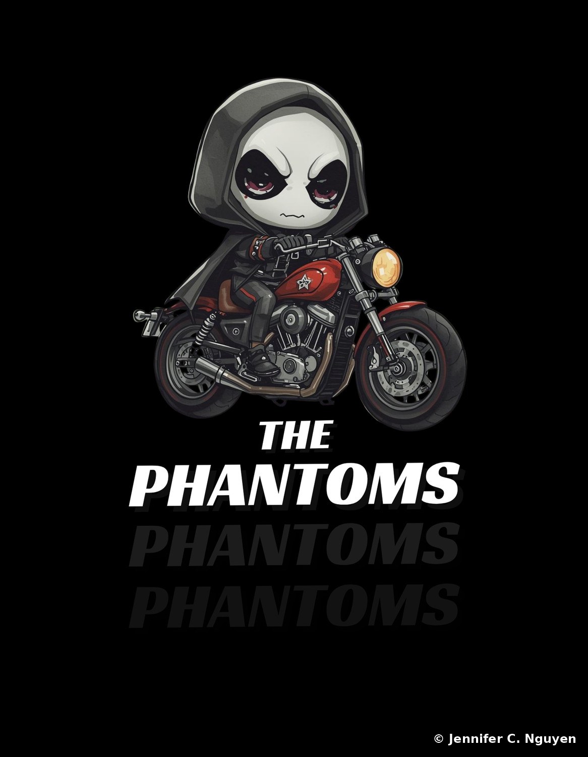
A large-eyed hooded skeleton mascot with a somber expression riding a red vintage-style motorcycle with a star-badge fuel tank, 'BORN THE PHANTOMS' in bold layered white lettering with a repeated drop-shadow effectCharacter Mascot — hooded alien skull rider
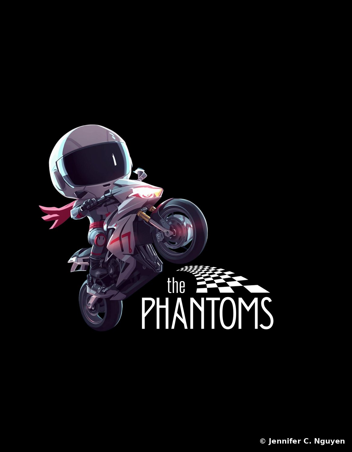
A colorful chibi astronaut-helmeted racer mascot popping a wheelie on a white and red motorcycle, a pink scarf trailing behind, with a checkered flag graphic and 'the PHANTOMS' lettering belowRacer Mascot — wheelie with checkered flag

10 of 47 concepts shown here, curated to represent the range; the full set is available on request.
Brand Design Print & Digital · Multilingual · Canva
01
Mon Cafe Posters

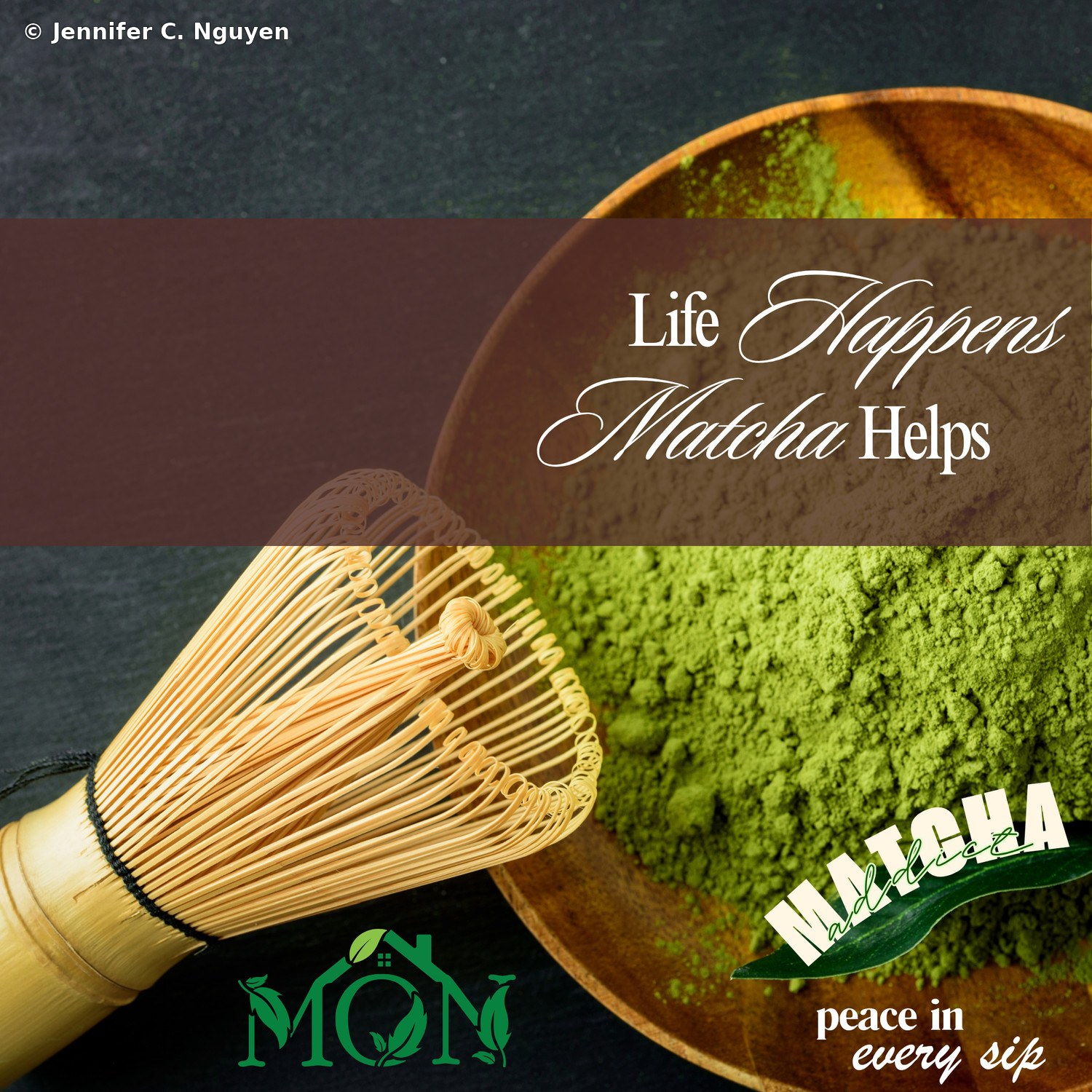
Matcha-themed promotional posters riding the wellness trend, pairing moody, editorial photography of whisked matcha with a playful "Matcha Addict" badge and the tagline "find peace in every sip," extending the Mon Cafe mark into everyday marketing.

Poster DesignMatcha & WellnessCampaign
Three-panel matcha promotional poster with a dark charcoal top band, a warm brown middle band featuring the italic script headline Life Happens Matcha Helps over a blurred bowl of matcha powder, and a bottom band showing a bamboo chasen whisk beside a mound of vivid green matcha powder in a wooden bowl, the green Mon Cafe logo in the bottom left corner and a dark green ribbon badge reading Matcha Addict with the tagline peace in every sip in the bottom rightBrown Matcha Poster — three-panel layout with Life Happens Matcha Helps headline
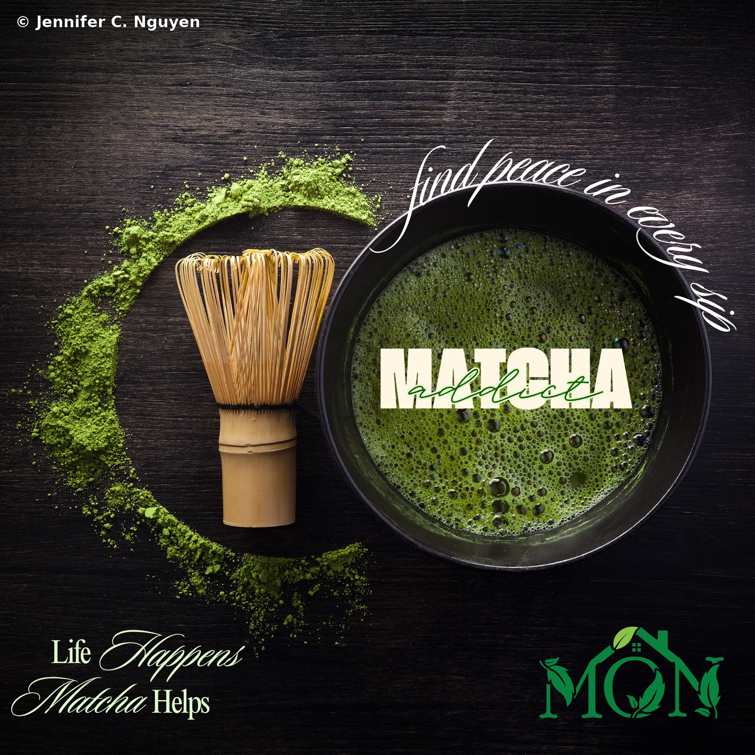
Dark wood-grain matcha poster featuring a bamboo whisk beside scattered matcha powder arranged in a circular sweep, a black bowl of frothy whisked matcha in the upper right with the cursive tagline find peace in every sip arching above it and bold cream text reading Matcha Addict over the bowl, a larger green Mon Cafe logo in the bottom right corner and the italic headline Life Happens Matcha Helps in the bottom leftDark Matcha Poster — corner logo placement with Matcha Addict badge
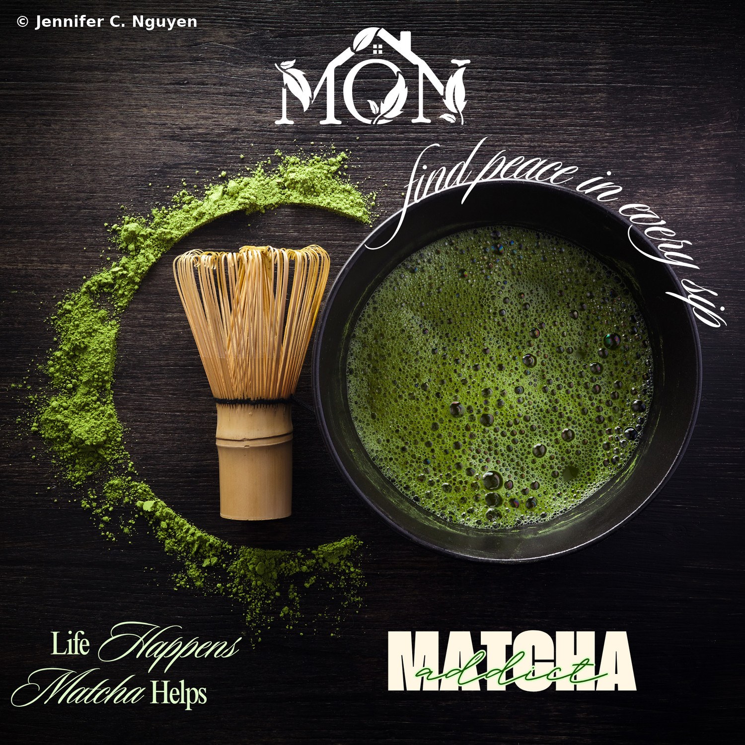
The same dark wood-grain matcha poster composition with a larger white version of the Mon Cafe logo centered at the top instead of in a corner, and the Matcha Addict wordmark rendered in bold cream block letters at the bottom rightDark Matcha Poster, Centered Logo — top-centered white logo variant
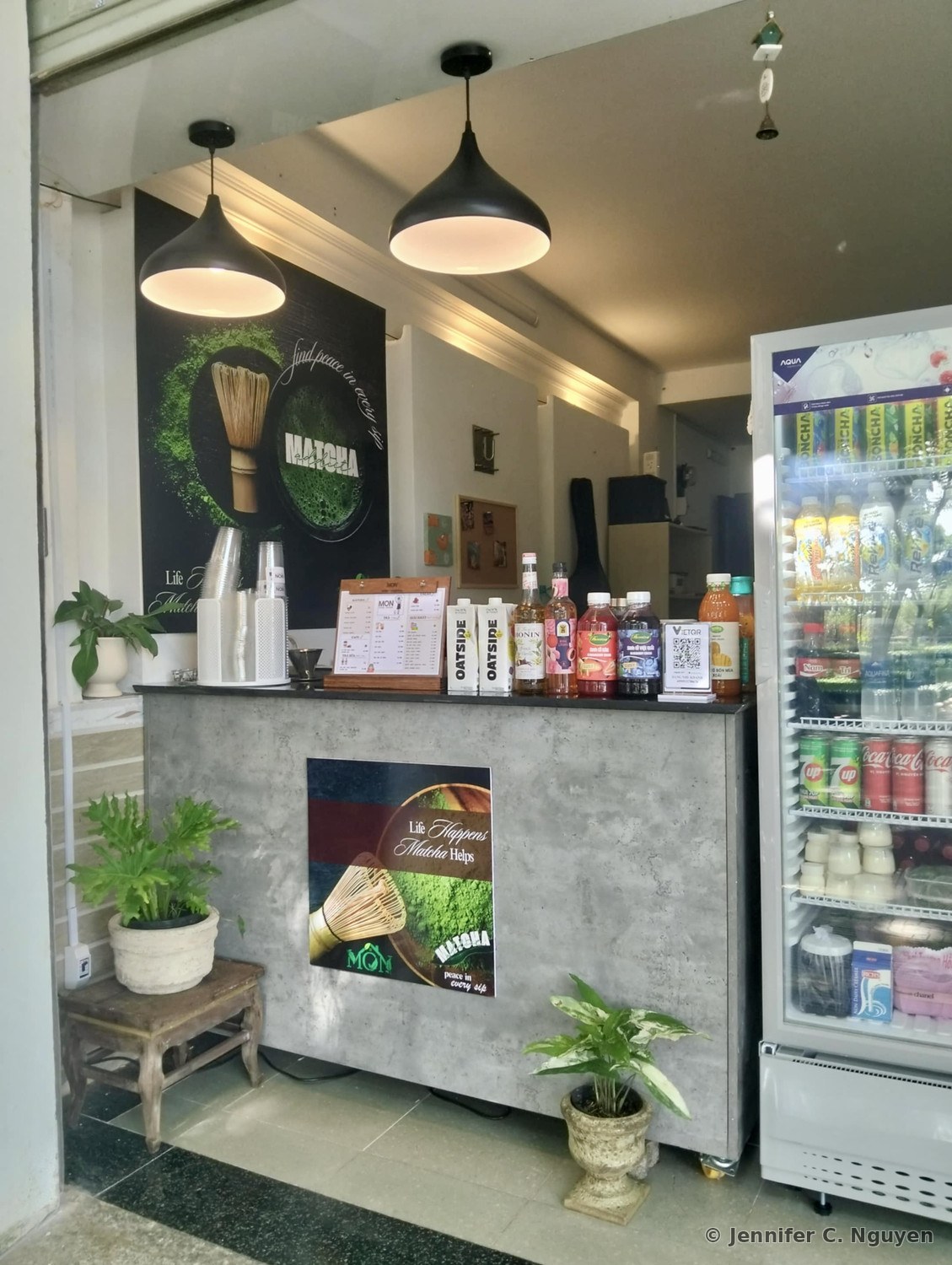
Both matcha posters printed and mounted in person at Mon Cafe's counter, the brown three-panel poster hanging on the wall above the drink station and the dark centered-logo poster mounted on the concrete counter face, surrounded by potted plants, a drink menu, and a beverage refrigeratorInstalled at Mon Cafe — posters printed and mounted in-store

02
New York Life Promotional Flyer

A retirement planning and rollover services flyer for a New York Life financial services professional, designed in both English and Vietnamese to reach the agent's bilingual client base. A bold New York City skyline header anchors the layout, closing with full contact details. The agent's real photo was swapped for a stylized animated avatar for portfolio display purposes, keeping the layout and message intact while respecting her privacy. Built for flyer stands in local stores and for handing out in person at community events and festivals throughout the year.

Flyer DesignMultilingualInsurance
English-language New York Life retirement planning flyer with a navy blue city skyline header, the headline Secure Your Future with Retirement Planning and Rollover Services, four white icon panels labeled Guidance, Seamless, Personalized, and Financial Strategies, and a contact section for financial professional Chi Rulapaugh, MBA, with a stylized animated avatar standing in for her real photoEnglish Version — promoting the agent's retirement planning services
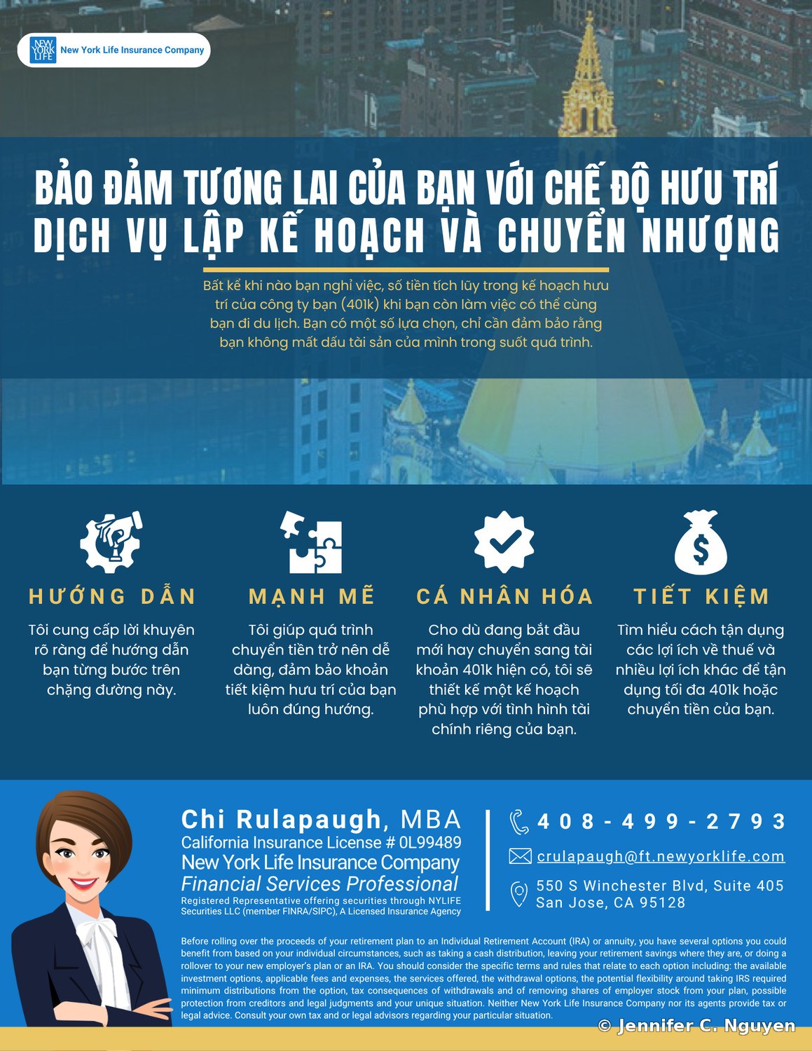
Vietnamese-language version of the same New York Life retirement planning flyer, translated headline and four benefit panels labeled Huong Dan, Manh Me, Ca Nhan Hoa, and Tiet Kiem, with the same layout, animated avatar, and contact details for financial professional Chi Rulapaugh, MBAVietnamese Version — translated for bilingual clients
03
Jenuine Heartfelt Design, Brand Color System

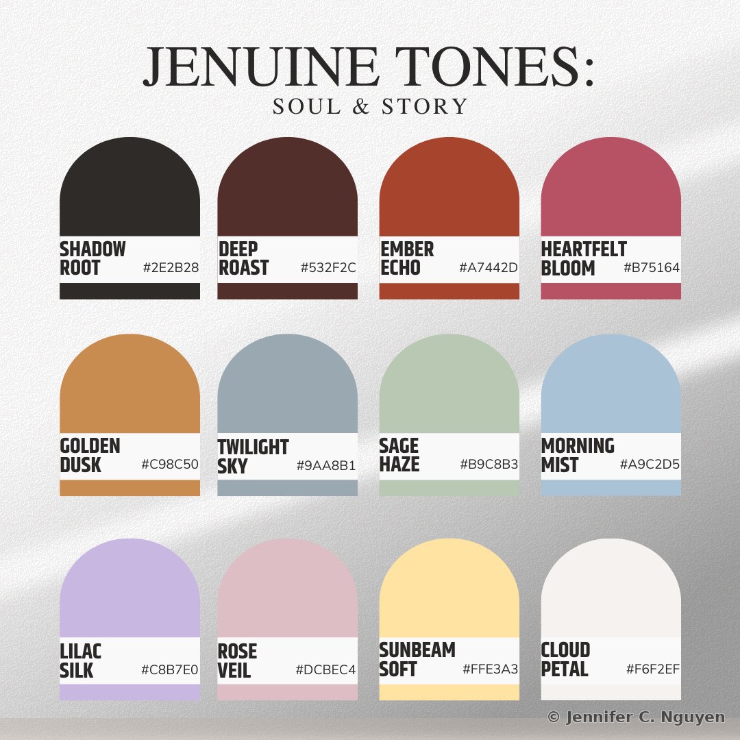
A self-directed color system for my own creative brand, each hue named and hex-coded to keep every product, post, and package visually consistent.

Color SystemPersonal BrandBrand Guidelines
Jenuine Tones, Soul & Story color palette chart showing twelve named and hex-coded swatches: Shadow Root #2E2B28, Deep Roast #532F2C, Ember Echo #A7442D, Heartfelt Bloom #B75164, Golden Dusk #C98C50, Twilight Sky #9AA8B1, Sage Haze #B9C8B3, Morning Mist #A9C2D5, Lilac Silk #C8B7E0, Rose Veil #DCBEC4, Sunbeam Soft #FFE3A3, and Cloud Petal #F6F2EFFull Palette — twelve named and hex-coded tones
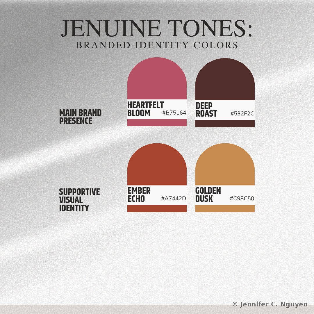
Jenuine Tones branded identity guide showing Heartfelt Bloom and Deep Roast assigned to main brand presence, and Ember Echo and Golden Dusk assigned to supportive visual identityBranded Identity Colors — primary and supportive roles
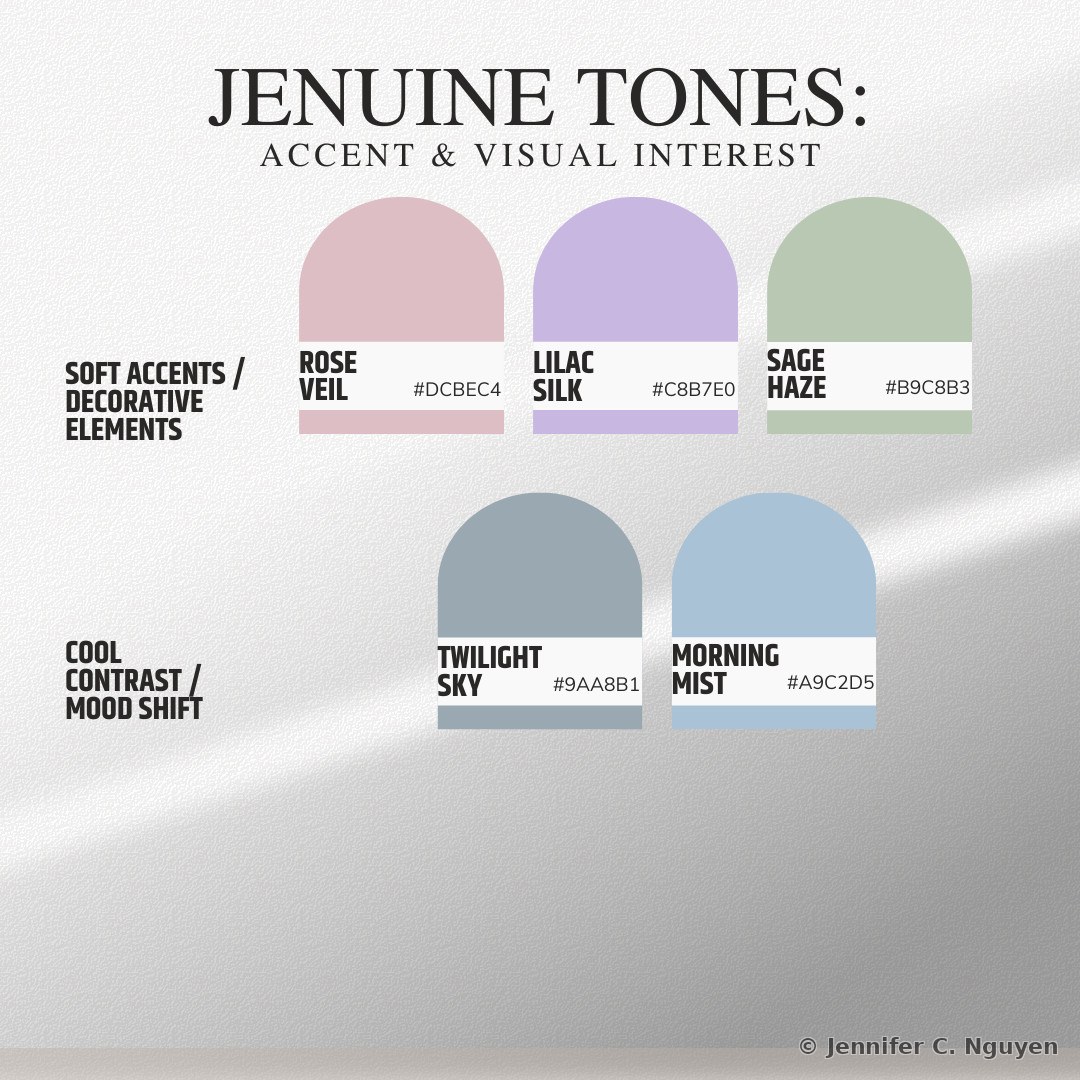
Jenuine Tones accent color guide showing Rose Veil, Lilac Silk, and Sage Haze assigned to soft accents and decorative elements, and Twilight Sky and Morning Mist assigned to cool contrast and mood shiftsAccent Colors — soft accents and cool contrast
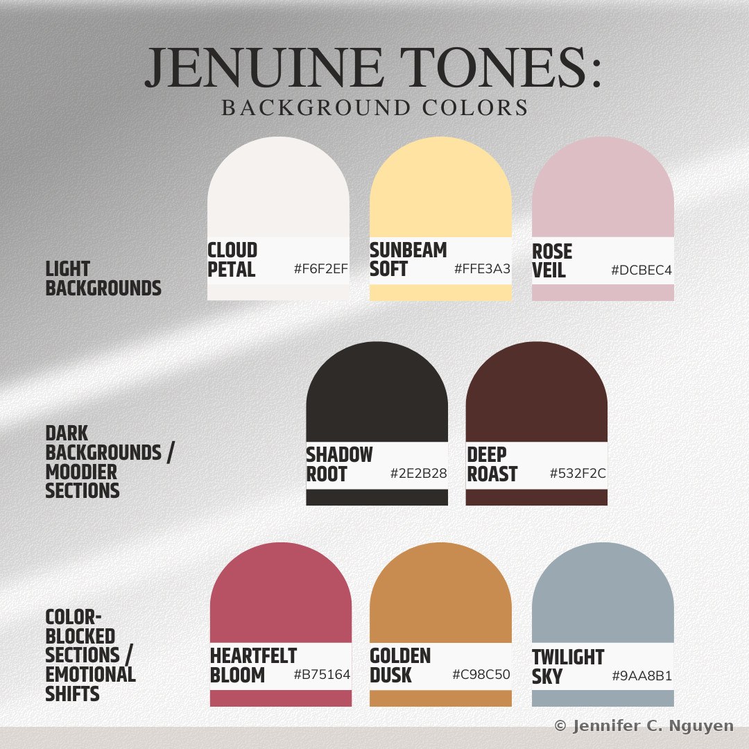
Jenuine Tones background color guide showing Cloud Petal, Sunbeam Soft, and Rose Veil assigned to light backgrounds, Shadow Root and Deep Roast assigned to dark and moodier sections, and Heartfelt Bloom, Golden Dusk, and Twilight Sky assigned to color-blocked sections and emotional shiftsBackground Colors — light, dark, and color-blocked uses
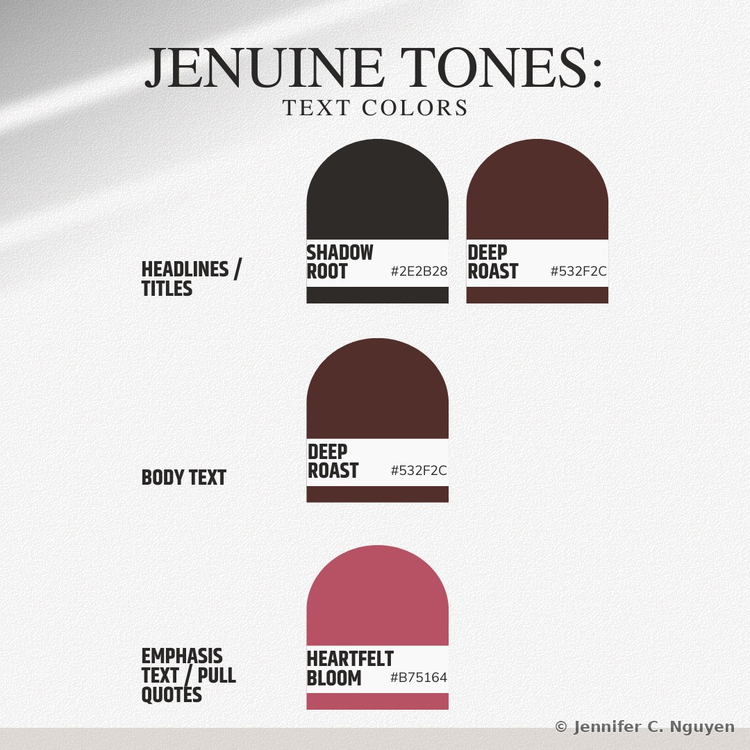
Jenuine Tones text color guide showing Shadow Root and Deep Roast assigned to headlines and titles, Deep Roast assigned to body text, and Heartfelt Bloom assigned to emphasis text and pull quotesText Colors — headlines, body, and emphasis
04
2024 Year of the Dragon Lucky Red Envelopes

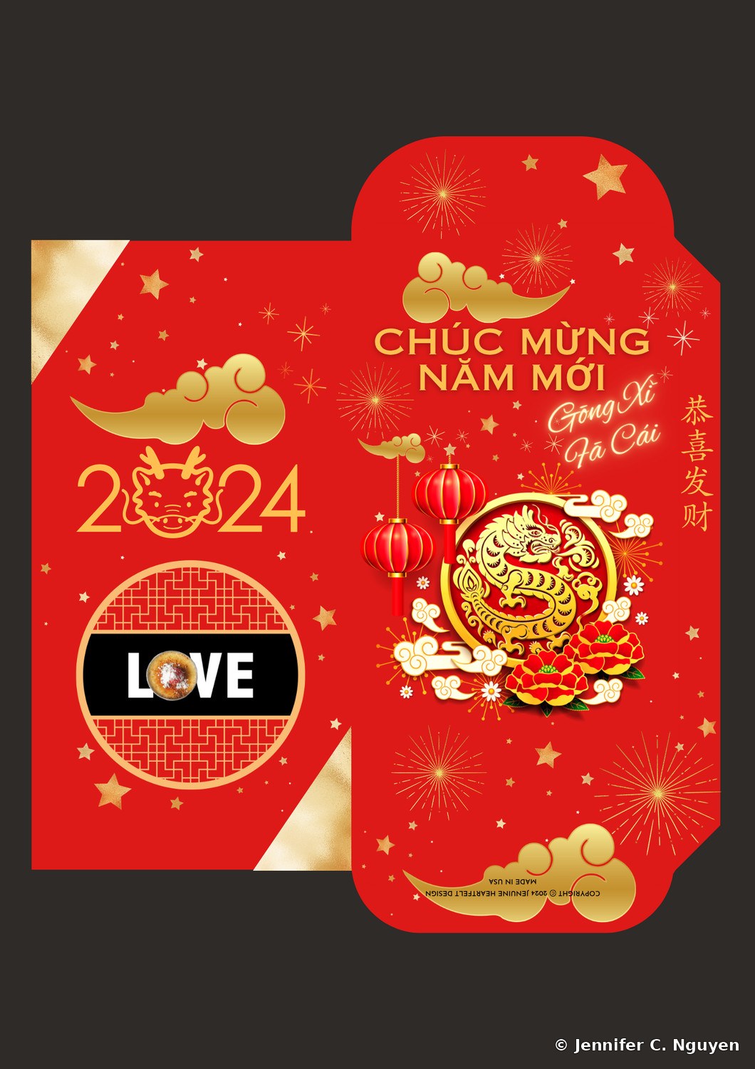
Custom lucky red envelope designs for the Year of the Dragon, the first year of this series, created for I Love Brulee, a handcrafted crème brûlée business based in San Jose and later featured on KRON4 and NBC Bay Area; Saigon Meats Manila, a Minneapolis-based Vietnamese-Filipino fusion restaurant that handed these out with coupons at Lunar New Year festivals; and Jenuine Heartfelt Design's own envelope. Saigon Meats Manila's deeper red was matched to their logo color rather than the traditional bright red, one of several fully custom color envelopes across this series.

Firecrackers, hanging lanterns, and a trail of gold coins run through each design, small, specific symbols of luck and celebration rather than one generic red rectangle. Red anchors the series for a reason: in Lunar New Year tradition, it wards off bad luck and welcomes good fortune each year.

The dragon itself is the most auspicious of the twelve zodiac animals, a symbol of power, strength, and good fortune woven into every envelope.

Lunar New YearCultural Design2024
2024 Year of the Dragon lucky red envelope for I Love Brulee, black background with a gold dragon medallion, red hanging lanterns, and the I Love Brulee LOVE logo on the inner panelI Love Brulee — gold dragon medallion design
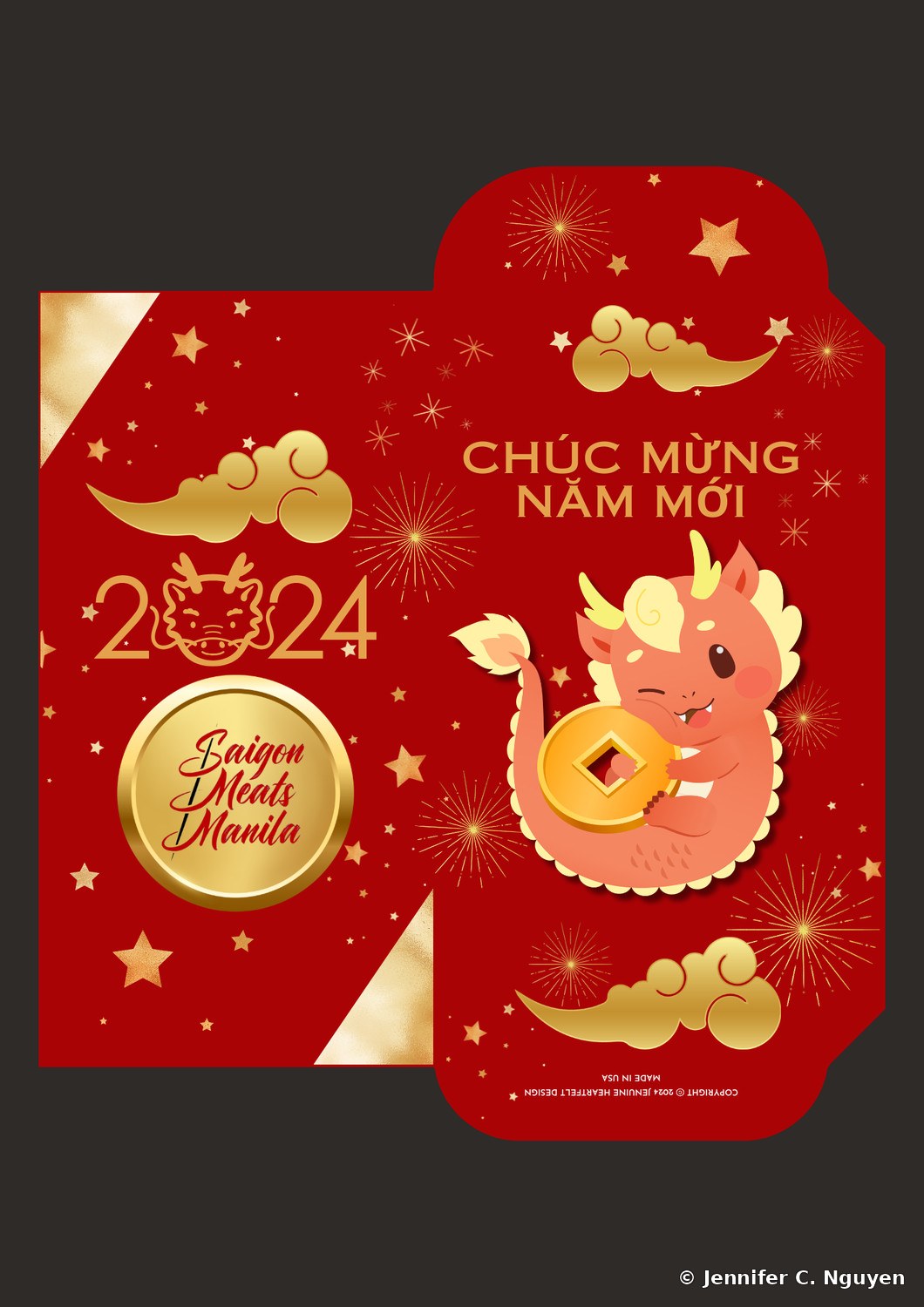
2024 Year of the Dragon lucky red envelope for Saigon Meats Manila, a cute cartoon baby dragon holding a gold coin while riding a red fish, with the Saigon Meats Manila circular logo on the inner panelSaigon Meats Manila — cartoon baby dragon design
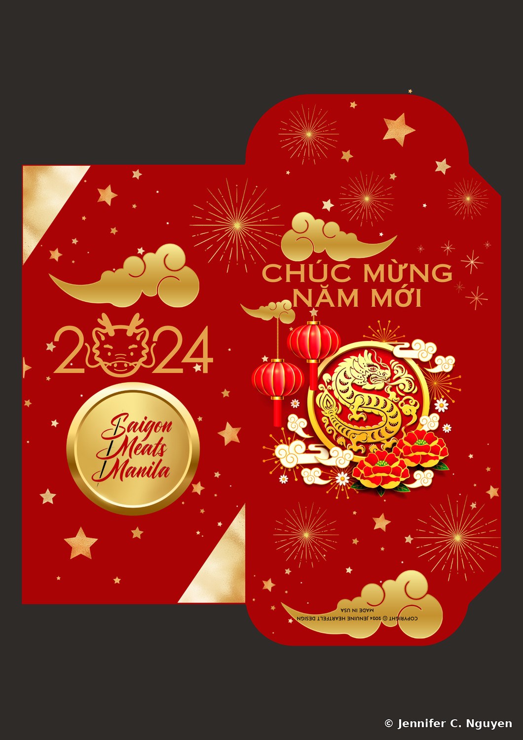
2024 Year of the Dragon lucky red envelope for Saigon Meats Manila, a gold dragon medallion design with hanging red lanterns and peony flowers, with the Saigon Meats Manila circular logo on the inner panelSaigon Meats Manila — gold dragon medallion design
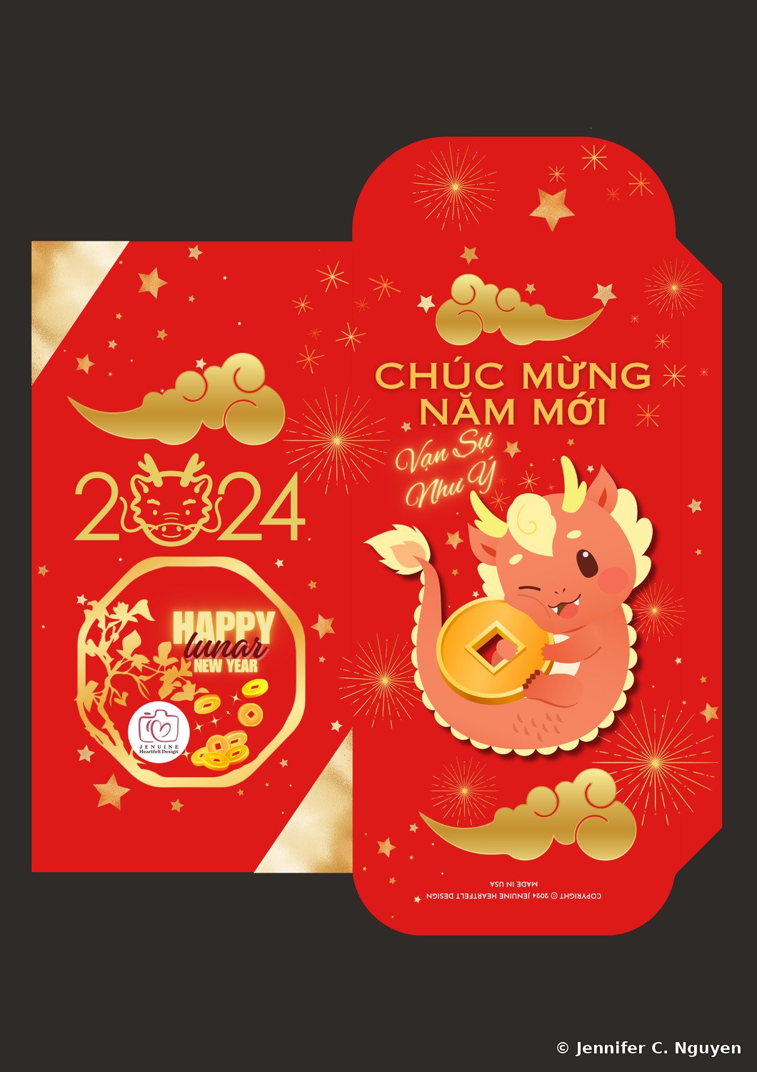
2024 Year of the Dragon lucky red envelope for Jenuine Heartfelt Design, a cute cartoon baby dragon holding a gold coin, with the Jenuine Heartfelt Design logo and a Happy Lunar New Year graphic on the inner panelJenuine Heartfelt Design — cartoon baby dragon design
05
2025 Year of the Snake Lucky Red Envelopes

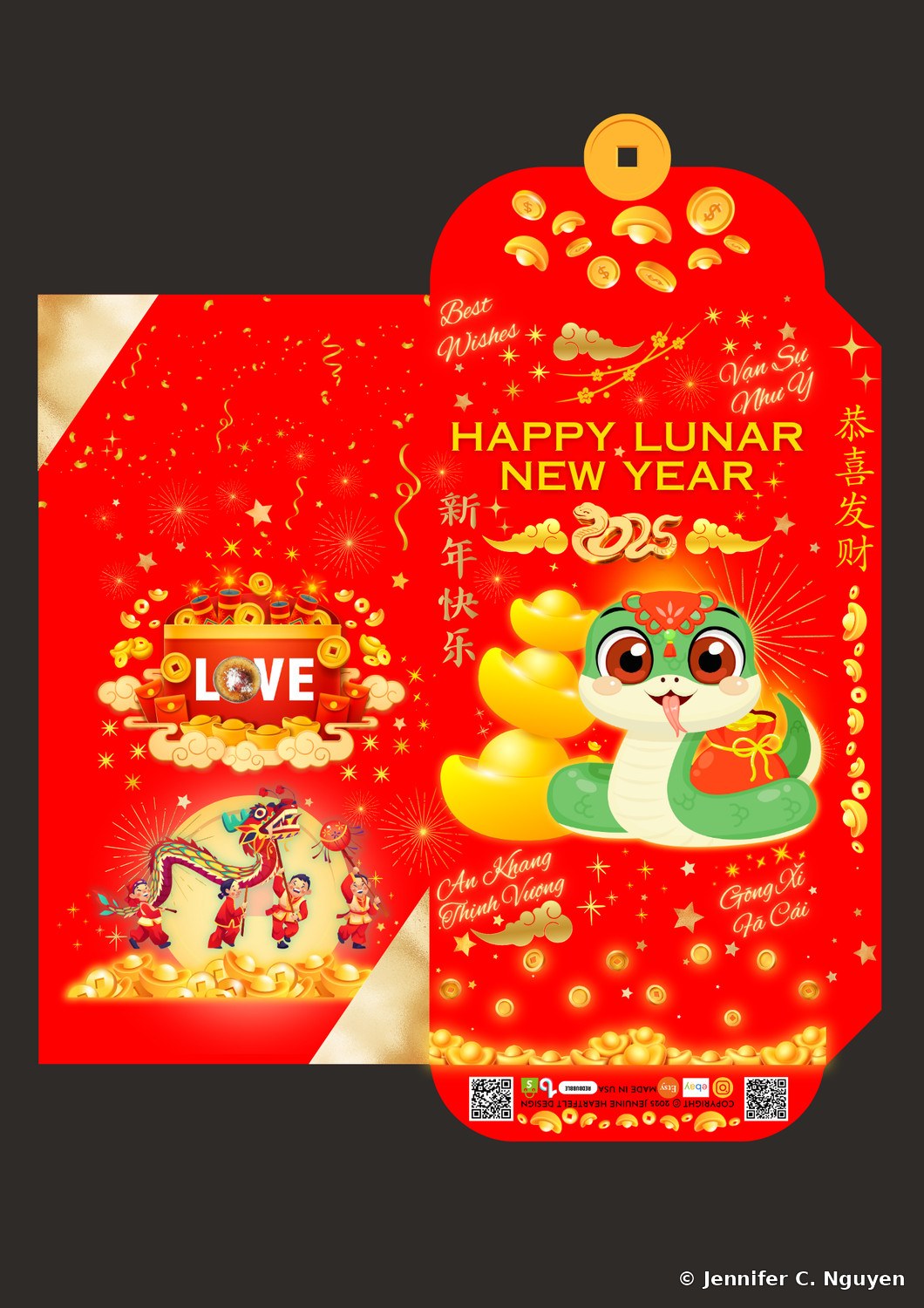
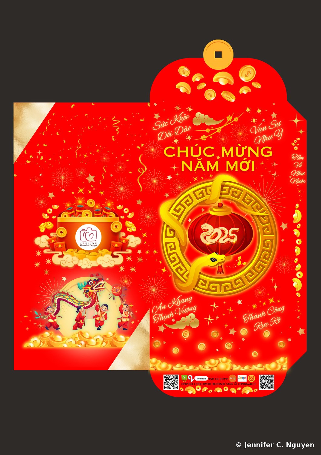
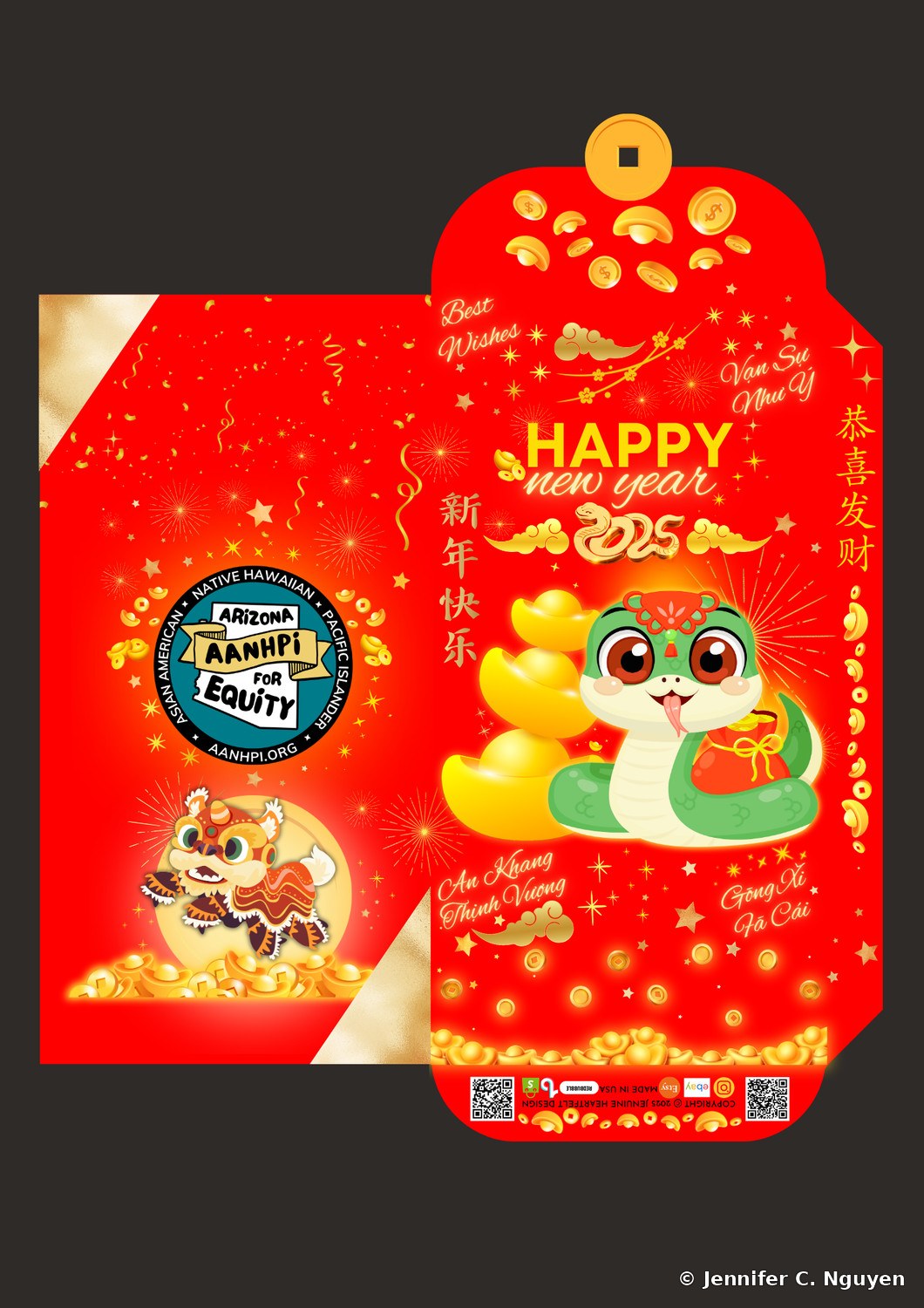
Custom lucky red envelope designs for the Year of the Snake, created for Arizona AANHPI for Equity, a Tempe-based 501(c)(3) nonprofit that distributed these to members, family, and friends; Fancy Flavors Bakeshop, a San Jose café that tucked coupons for the next holiday season inside; and returning client I Love Brulee. Jenuine Heartfelt Design's own gold snake design was gifted to community small businesses, restaurants and bakeries, as a good-luck token and a working mockup for future custom orders.

This year's flap became a gold coin shape in place of the standard curve, and the design leans into the joy of the holiday itself, lion dancers and laughing children on the back panel and stacked gold ingots, alongside blessings in English, Vietnamese, and Chinese, from Chúc Mừng Năm Mới to Gōng Xì Fā Cái, wishing prosperity in the language of whoever opens it.

The snake represents wisdom and transformation, shedding its skin each year as a symbol of renewal.

Lunar New YearCultural Design2025
2025 Year of the Snake lucky red envelope for Arizona AANHPI for Equity, a cute green cartoon snake wearing a red headpiece beside stacked gold ingots, with the Arizona AANHPI for Equity badge logo and a lion dance mascot on the inner panelArizona AANHPI for Equity — cartoon snake design
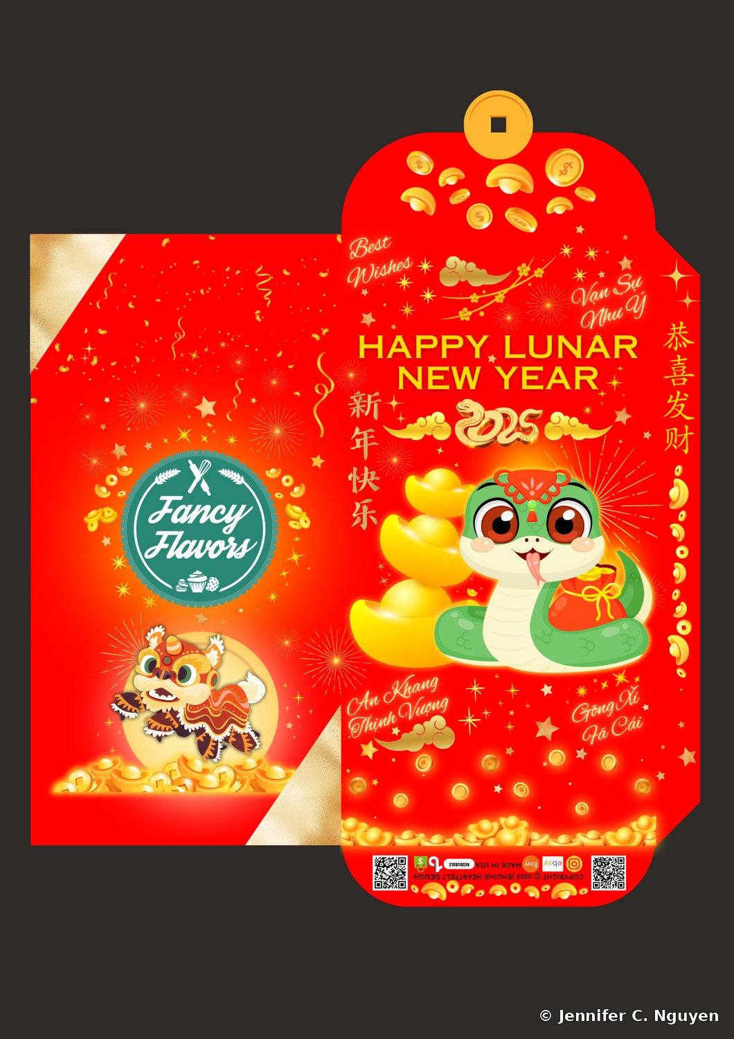
2025 Year of the Snake lucky red envelope for Fancy Flavors, the same cute green cartoon snake design beside stacked gold ingots, with the Fancy Flavors teal circular logo and a lion dance mascot on the inner panelFancy Flavors — cartoon snake design
2025 Year of the Snake lucky red envelope for I Love Brulee, the same cute green cartoon snake design, with a LOVE-branded firecracker box graphic and a lion and dragon dance illustration on the inner panelI Love Brulee — cartoon snake design
2025 Year of the Snake lucky red envelope for Jenuine Heartfelt Design, a gold coiled snake wrapped around a red lantern medallion, with the Jenuine Heartfelt Design logo and a lion dance mascot on the inner panelJenuine Heartfelt Design — gold snake lantern design
06
2026 Year of the Horse Lucky Red Envelopes

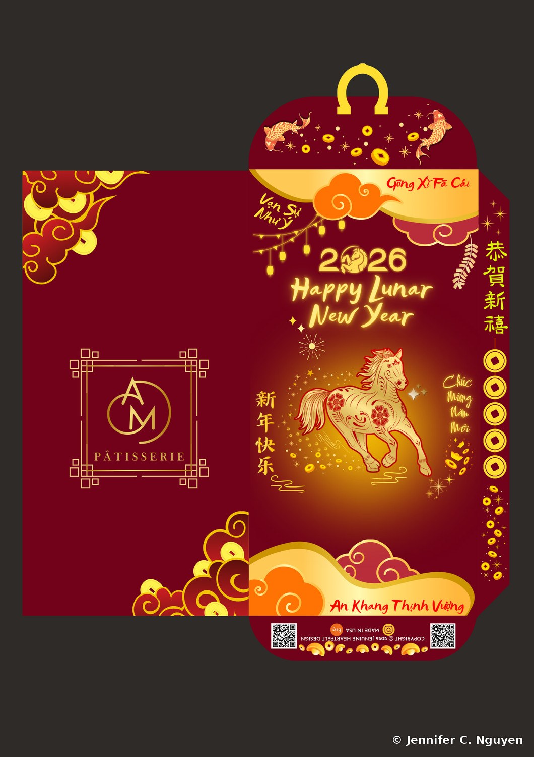
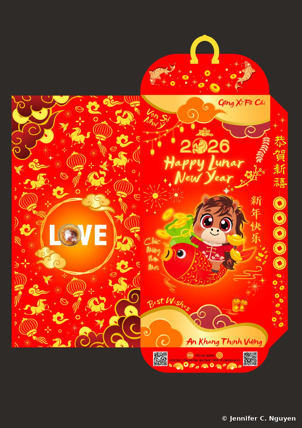
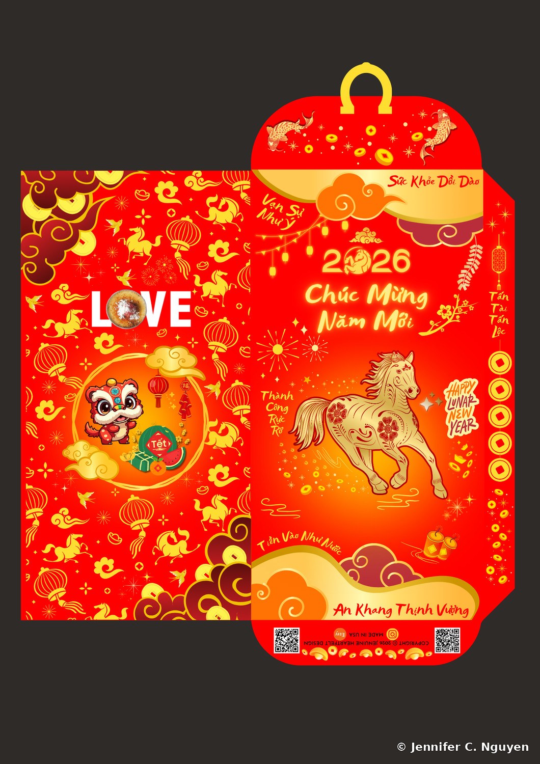
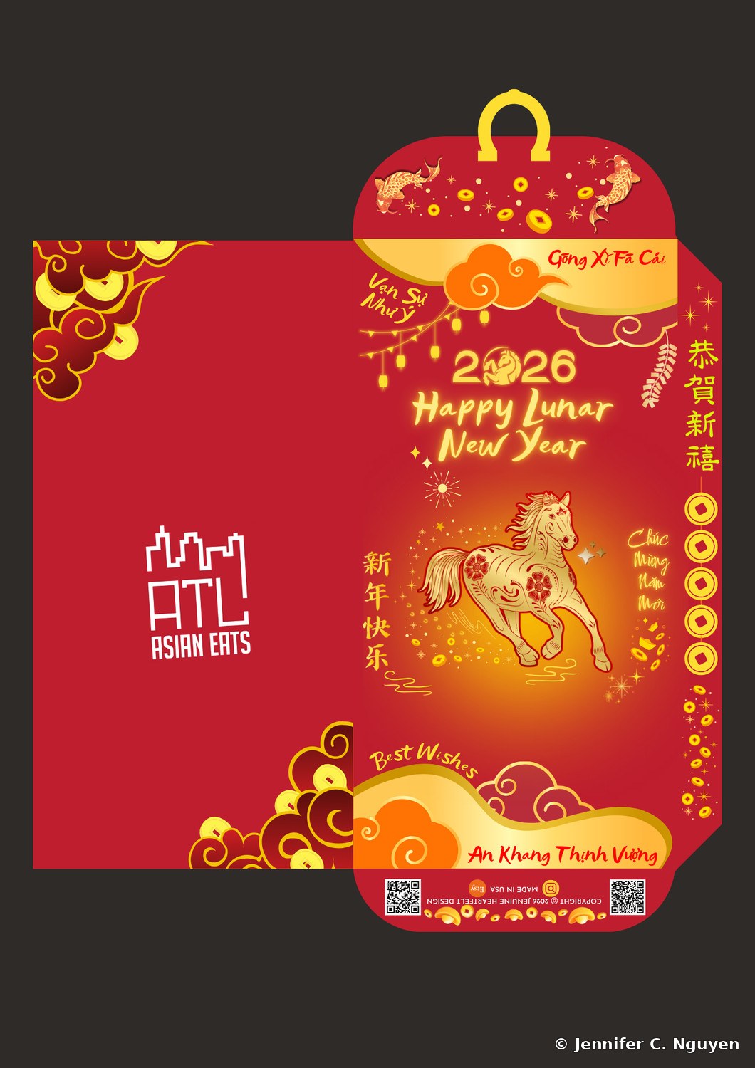
Custom lucky red envelope designs for the Year of the Horse, created for ATL Asian Eats, a 40,000-member Atlanta community connecting people to Asian-owned restaurants since 2019; A&M Patisserie, a San José pop-up bakery featured by KQED for its eighteen egg tart flavors and handed out with coupons across multiple community Lunar New Year events; and returning client I Love Brulee. ATL Asian Eats' red was matched to their logo color the same way Saigon Meats Manila's was in 2024, while A&M chose their own modern deep burgundy.

This year's flap became a lucky horseshoe shape, and the back panel got its most playful treatment yet: a watermelon and bánh tét spread, blooming cây mai branches (yellow apricot blossom, a Vietnamese Tet symbol of luck and new beginnings), and two koi fish curved around each other in a yin and yang formation, representing the balance of opposing forces, whimsical details meant to turn each envelope into something worth keeping.

This year's horse carries its own symbolism: freedom, energy, and perseverance, fitting for a year built on momentum and forward motion.

Lunar New YearCultural Design2026
2026 Year of the Horse lucky red envelope for ATL Asian Eats, a gold floral horse running through fireworks and hanging lanterns, with the ATL Asian Eats skyline logo on the inner panelATL Asian Eats — gold horse design
2026 Year of the Horse lucky red envelope for A&M Patisserie, the same gold floral horse design on a deep maroon background, with the A&M Patisserie gold monogram logo on the inner panelA&M Patisserie — gold horse design
2026 Year of the Horse lucky red envelope for I Love Brulee, a cute cartoon baby horse holding gold coins while riding a red fish, with the I Love Brulee LOVE logo on the inner panelI Love Brulee — cartoon horse design
2026 Year of the Horse lucky red envelope for I Love Brulee, a gold floral horse illustration with Vietnamese New Year greetings, a lion dance mascot, and a watermelon Tet graphic on the inner panelI Love Brulee — gold horse design
07
Jenuine Heartfelt Design, Business Services Flyer

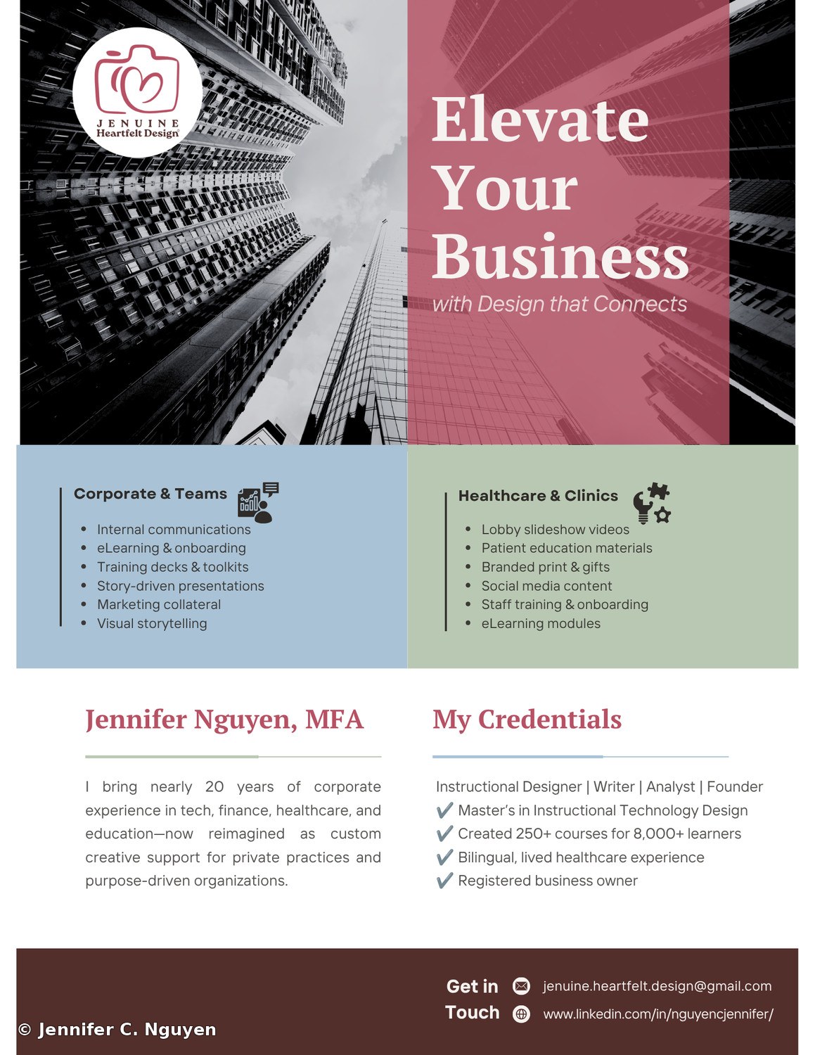
A self-promotional flyer introducing Jenuine Heartfelt Design as a business, shared on LinkedIn before this website existed as many prospective clients' first look at what I offer. The two-panel layout pairs a moody, upward-angle city photo with a bold magenta gradient, a deliberate move away from the generic corporate-stock look, then splits into color-coded service lists so corporate and healthcare audiences can each find themselves quickly.

The credentials panel condenses close to two decades of corporate experience across tech, finance, and healthcare into a short trust-building summary: a master's in instructional technology design, 250-plus courses built for 8,000-plus learners, and status as a registered business owner.

Self-PromotionService FlyerFounder Brand
Two-panel self-promotional business flyer for Jenuine Heartfelt Design, a black and white upward-angle photo of skyscrapers on the left beside a magenta gradient panel reading Elevate Your Business with Design that Connects, below a blue Corporate and Teams service list and a green Healthcare and Clinics service list, and a bottom section introducing Jennifer Nguyen MFA with a credentials list and contact detailsBusiness Services Flyer — LinkedIn one-sheet covering corporate and healthcare offerings
08
Jenuine Heartfelt Design, Etsy Shop Flyer

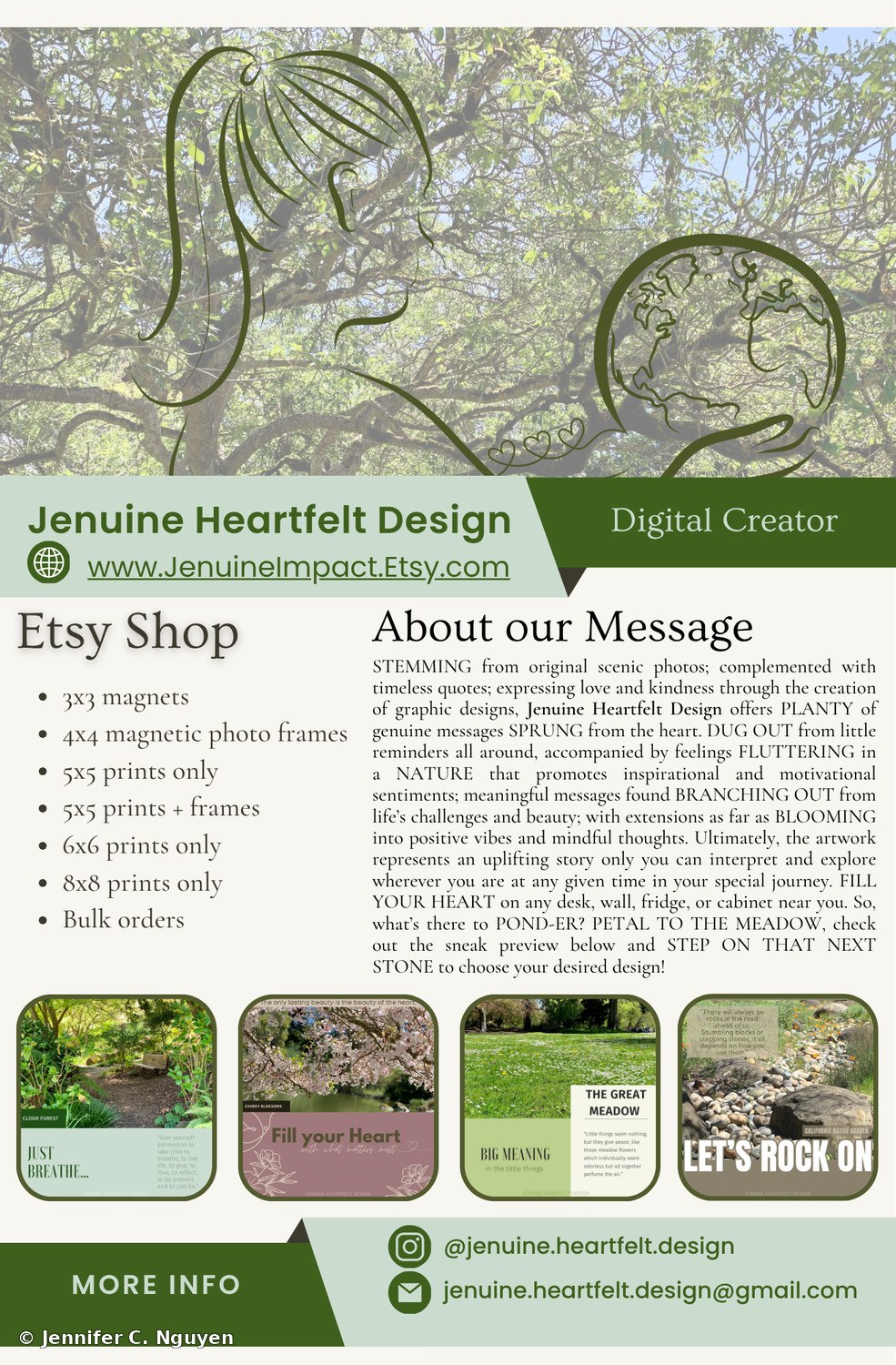
The first flyer I ever made, for my first product offering: the Jenuine Heartfelt Design Etsy shop, pairing original nature photography with short reflective quotes across magnets, photo frames, and prints. The header illustration follows the shape of the tree canopy itself, a silhouette and a globe cupped in two hands layered over the branches the way I actually saw them, meant to evoke mother nature and care.

Four sample designs anchor the flyer, each pairing a photo with a short reminder: a forest path to just breathe, cherry blossoms to fill your heart with what matters, an open meadow where small things carry big meaning, and a rock garden about choosing to see obstacles as stepping stones instead of stumbling blocks.

It's the clearest look at how this business actually started, from a place of quiet motivation and positivity, before growing into everything the Jenuine name covers now: brand and product design, video, patient education, and L&D consulting.

Etsy ShopNature PhotographyPhoto Prints
Promotional flyer for the Jenuine Heartfelt Design Etsy shop, a tree canopy photo overlaid with an illustrated silhouette of a woman and a globe cupped in two hands with small hearts, both shaped along the tree's branches, below a green Etsy Shop product list of magnets, magnetic photo frames, and prints in multiple sizes, an About our Message paragraph, and four sample product thumbnails: a forest path captioned Just Breathe, cherry blossoms captioned Fill your Heart, a grassy meadow captioned Big Meaning, and a rock garden captioned Let's Rock OnEtsy Shop Flyer — my first flyer, first product offering

Design & Composite Work Concept & Practice Pieces · Adobe Photoshop · Graduate Coursework
01
Photoshop Portfolio, Concept & Composite Work

A collection of practice and concept pieces built entirely in Adobe Photoshop during graduate coursework, spanning photo compositing, poster recreation, infographic design, and website and app interface mockups. A couple were built as recreations of real, well-known brands' interfaces or advertisements, purely for design practice, with no client relationship implied.

Also includes a set of before-and-after photo restoration pieces, working from personal and archival photographs to practice tear repair, colorization, tone correction, and compositing techniques, along with an original short poem set into a typography and photo composite piece.

Photo CompositingPoster DesignInfographic DesignUI MockupsPhoto RestorationTypography
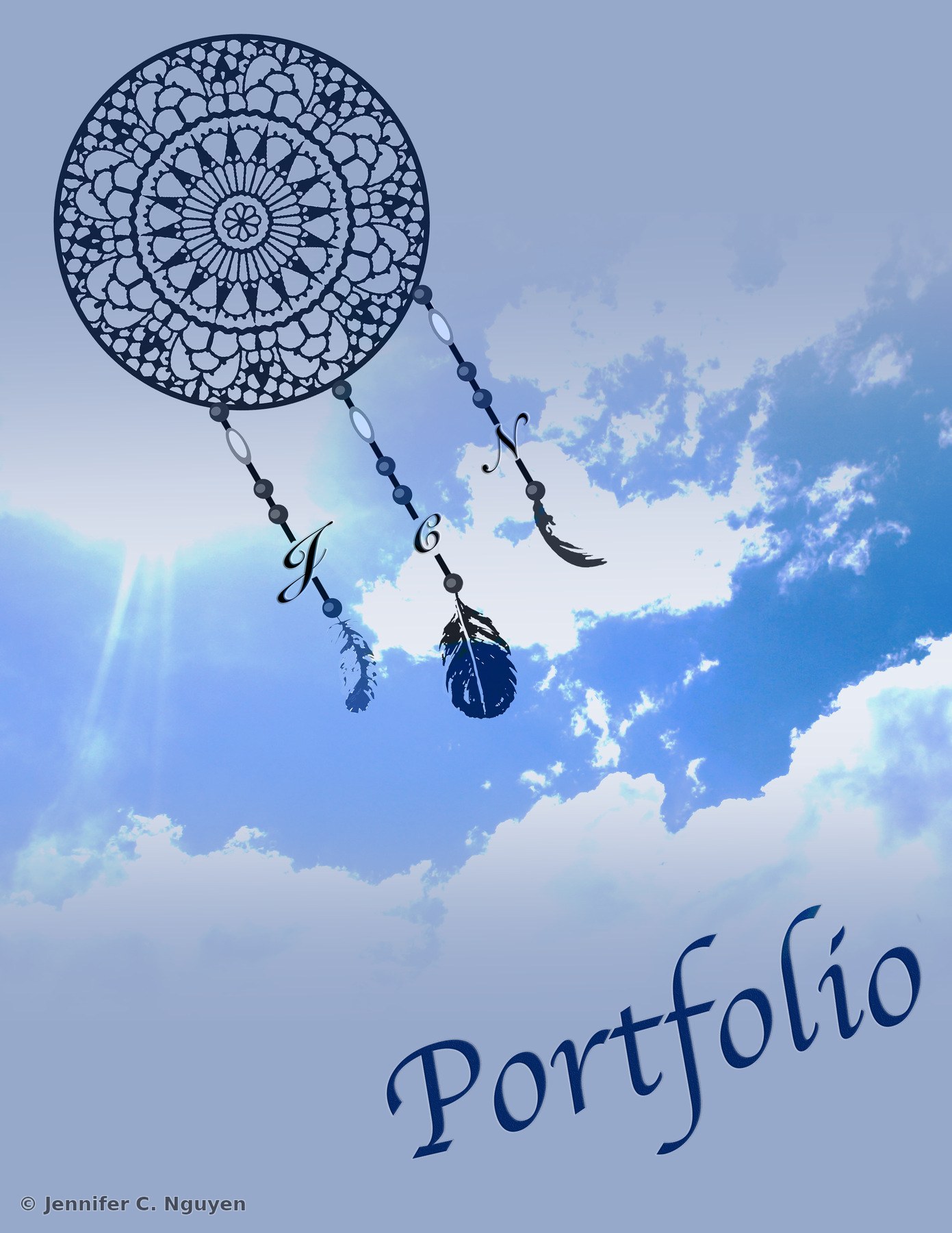
Portfolio front cover design featuring an illustrated navy blue dreamcatcher with beaded strands and feathers layered over a bright blue sky and cloud photograph, with Jennifer C. Nguyen's initials worked into the beaded strands and the word Portfolio in script across the bottomPortfolio Front Cover — illustrated dreamcatcher composite over a sky photograph
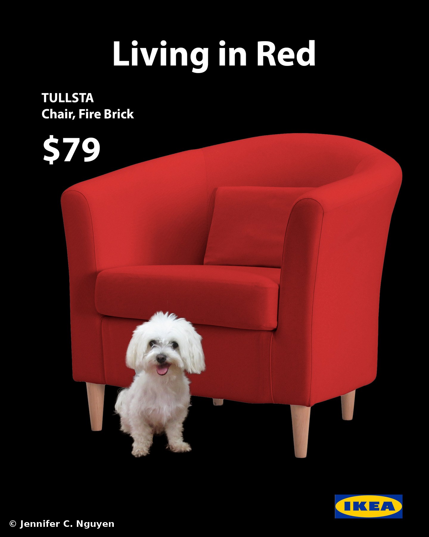
Mock print advertisement titled Living in Red for a red IKEA Tullsta armchair priced at $79, featuring a small white fluffy dog sitting in front of the chair, with the IKEA logo in the bottom cornerLiving in Red — photo compositing and cutout practice for a mock print ad
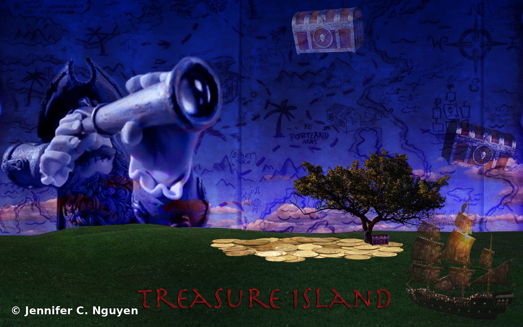
Fantasy photo composite titled Treasure Island showing a pirate silhouette looking through a spyglass toward a distant treasure chest, with a pile of gold coins, a tree, and a pirate ship layered over a hand-drawn treasure map background
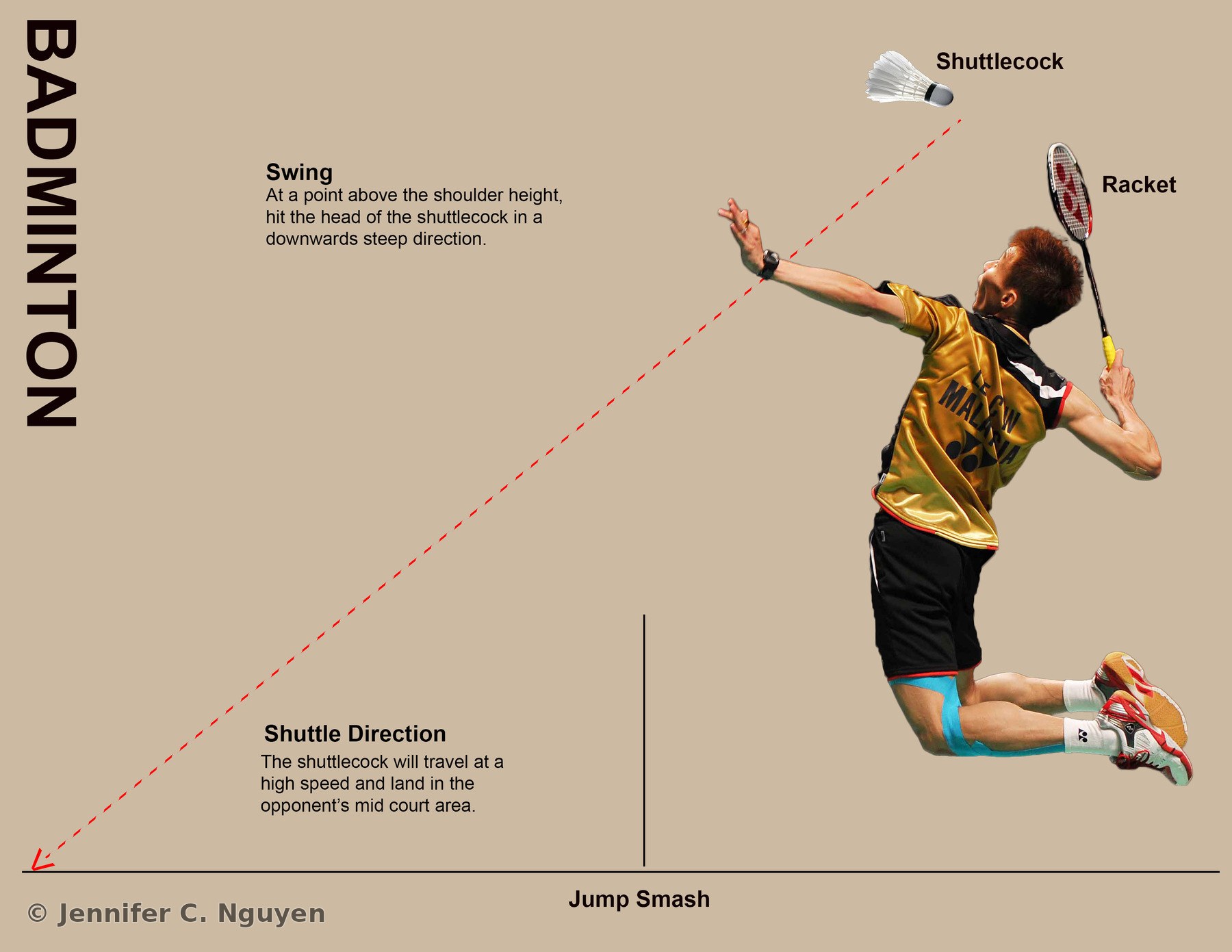
Sports technique infographic titled Badminton illustrating a jump smash, with a photo of a badminton player mid-jump labeled Shuttlecock and Racket, alongside a dotted red line diagram showing swing angle and shuttle direction toward the opponent's court
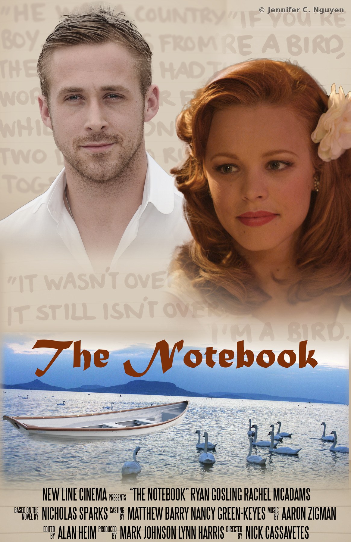
Recreated movie poster for The Notebook featuring composited portraits of a man and woman over a handwritten letter background, with a rowboat and swans on a lake below the title and full cast and crew credits at the bottomThe Notebook — recreated movie poster composite
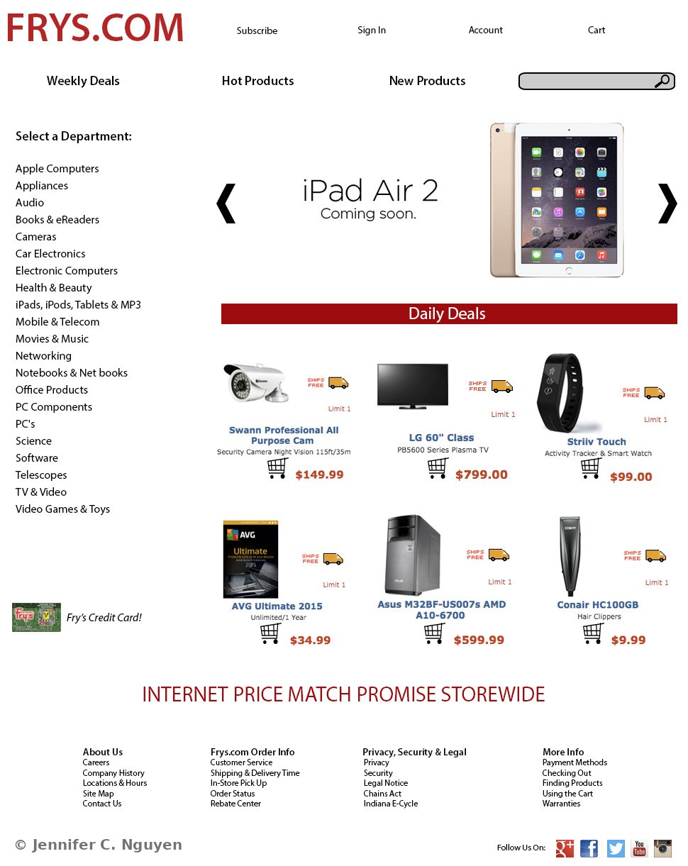
Mock desktop e-commerce homepage design for Frys.com featuring a red header navigation bar, a featured iPad Air 2 product carousel, a department list sidebar, and a grid of six daily deal products with prices and shipping iconsFrys.com Desktop Homepage — e-commerce interface concept
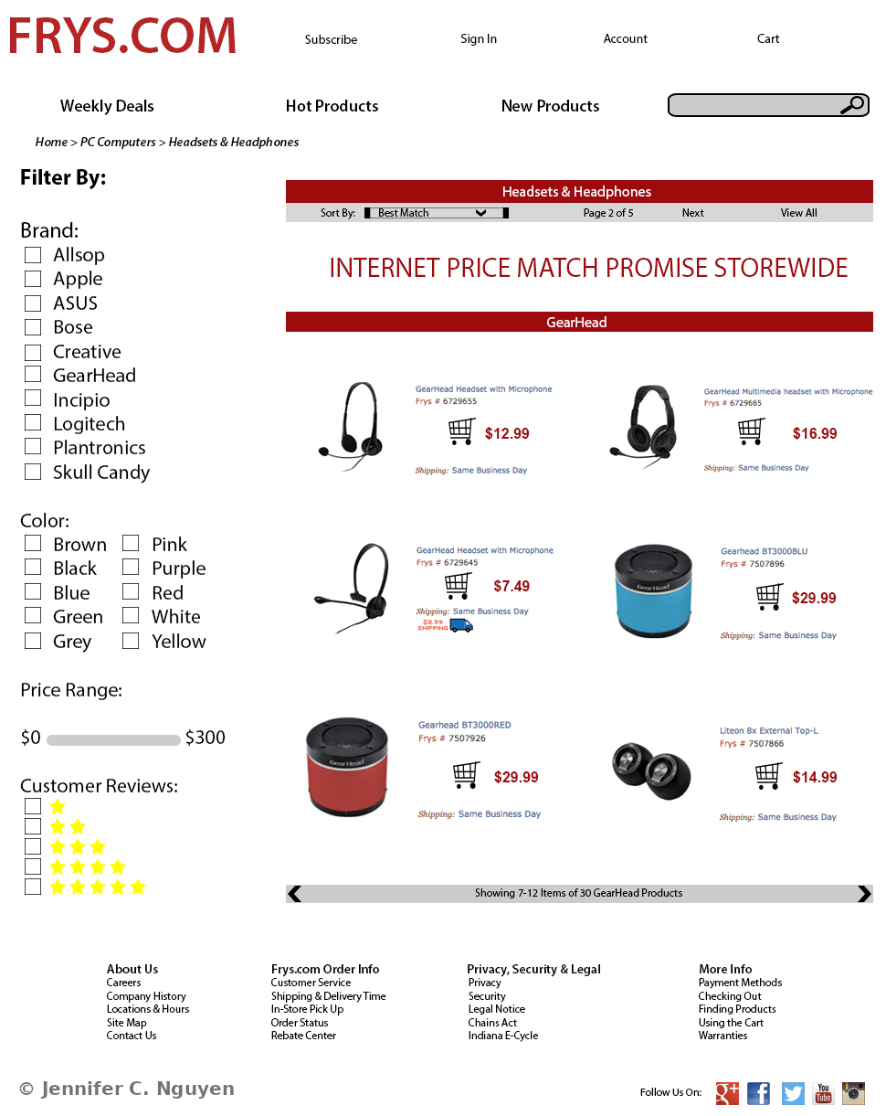
Mock desktop e-commerce category page design for Frys.com showing a Headsets and Headphones product listing with a brand, color, price range, and customer review filter sidebar, and a grid of six GearHead-brand products with pricesFrys.com Category Page — e-commerce filter and listing concept
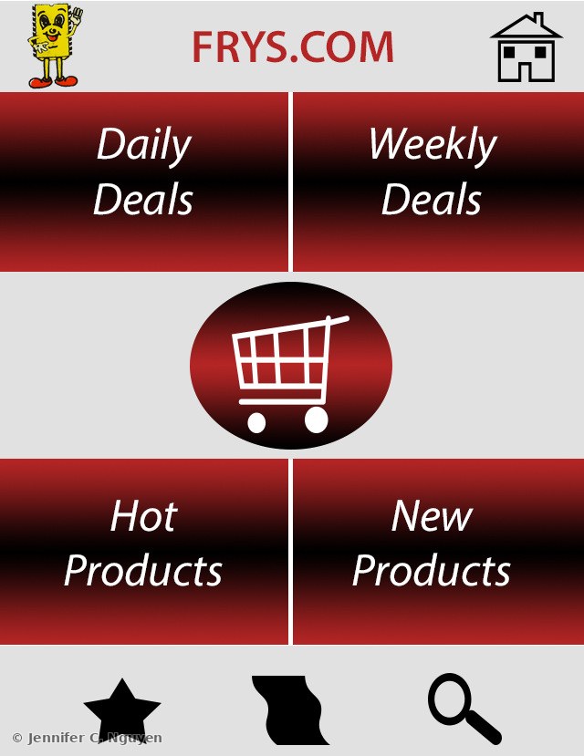
Mock mobile app home screen design for Frys.com with a red and gray grid layout of four large tappable tiles labeled Daily Deals, Weekly Deals, Hot Products, and New Products, a central shopping cart icon, and star, filter, and search icons along the bottomFrys.com Mobile Home — app interface concept
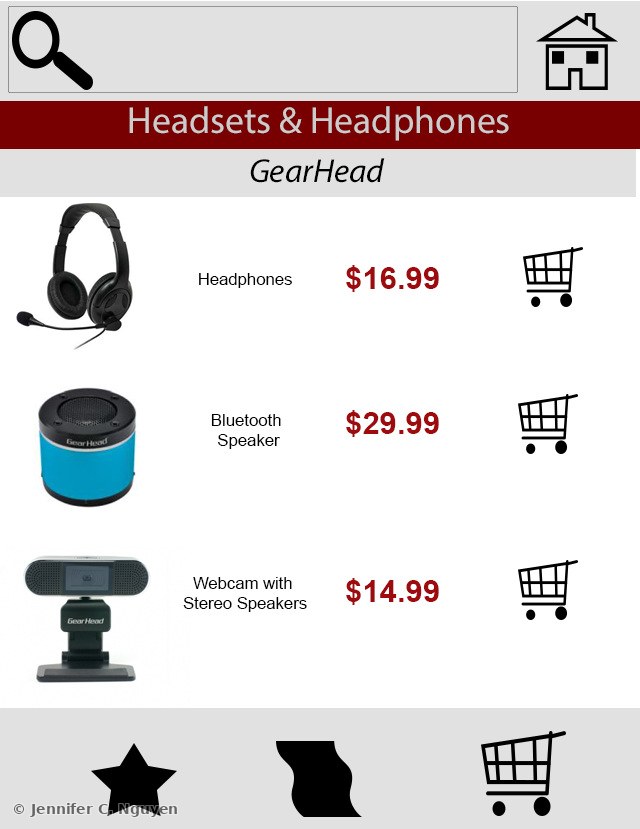
Mock mobile app category page design for Frys.com showing three GearHead-brand headset and speaker products stacked vertically with product photos, names, and prices, plus star, filter, and cart icons along the bottomFrys.com Mobile Category — app product listing concept
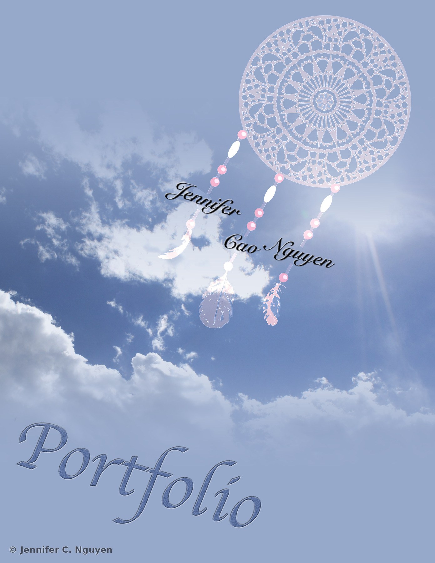
Portfolio back cover design featuring an illustrated pale blue and pink dreamcatcher with beaded strands and feathers layered over a bright blue sky and cloud photograph, with Jennifer Cao Nguyen's full name spelled out along the beaded strands and the word Portfolio in script across the bottomPortfolio Back Cover — illustrated dreamcatcher composite, closing bookend

Before & AfterPhoto Restoration, Colorization & Compositing · Graduate Coursework
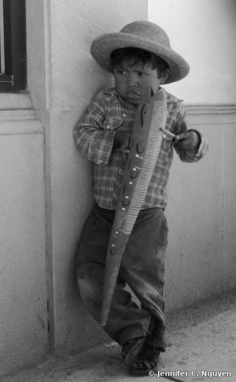
Before — Original
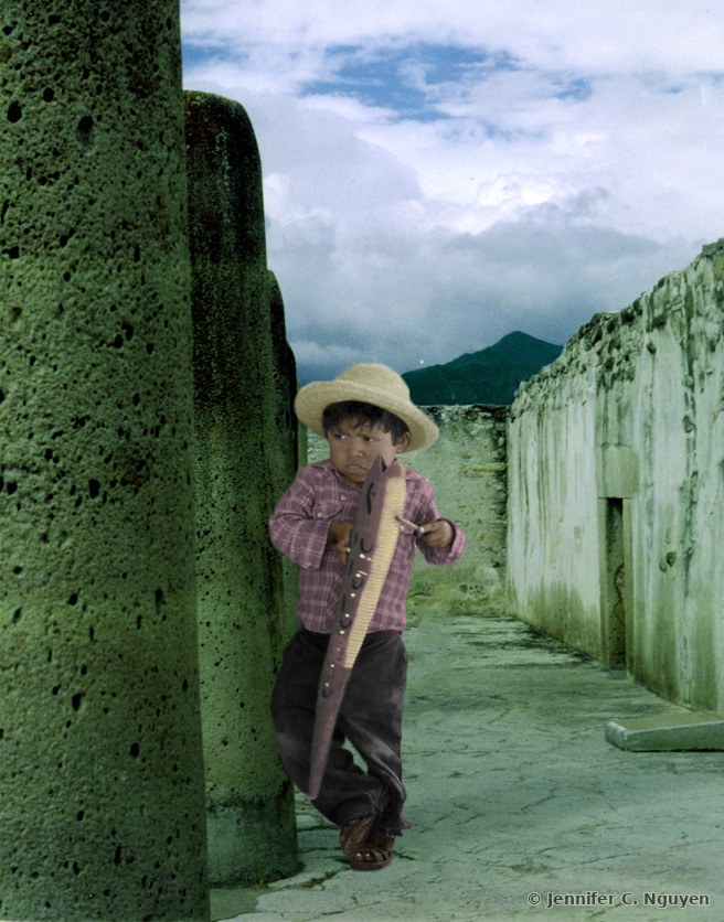
Original black-and-white archival photograph of a young boy wearing a hat, leaning against a wall and holding a decorative wooden tool
After — Restored
Colorized and re-composited version of the same photograph, showing the boy in color, placed into a new outdoor scene with ancient stone walls, mountains, and a cloudy sky
Before — Original
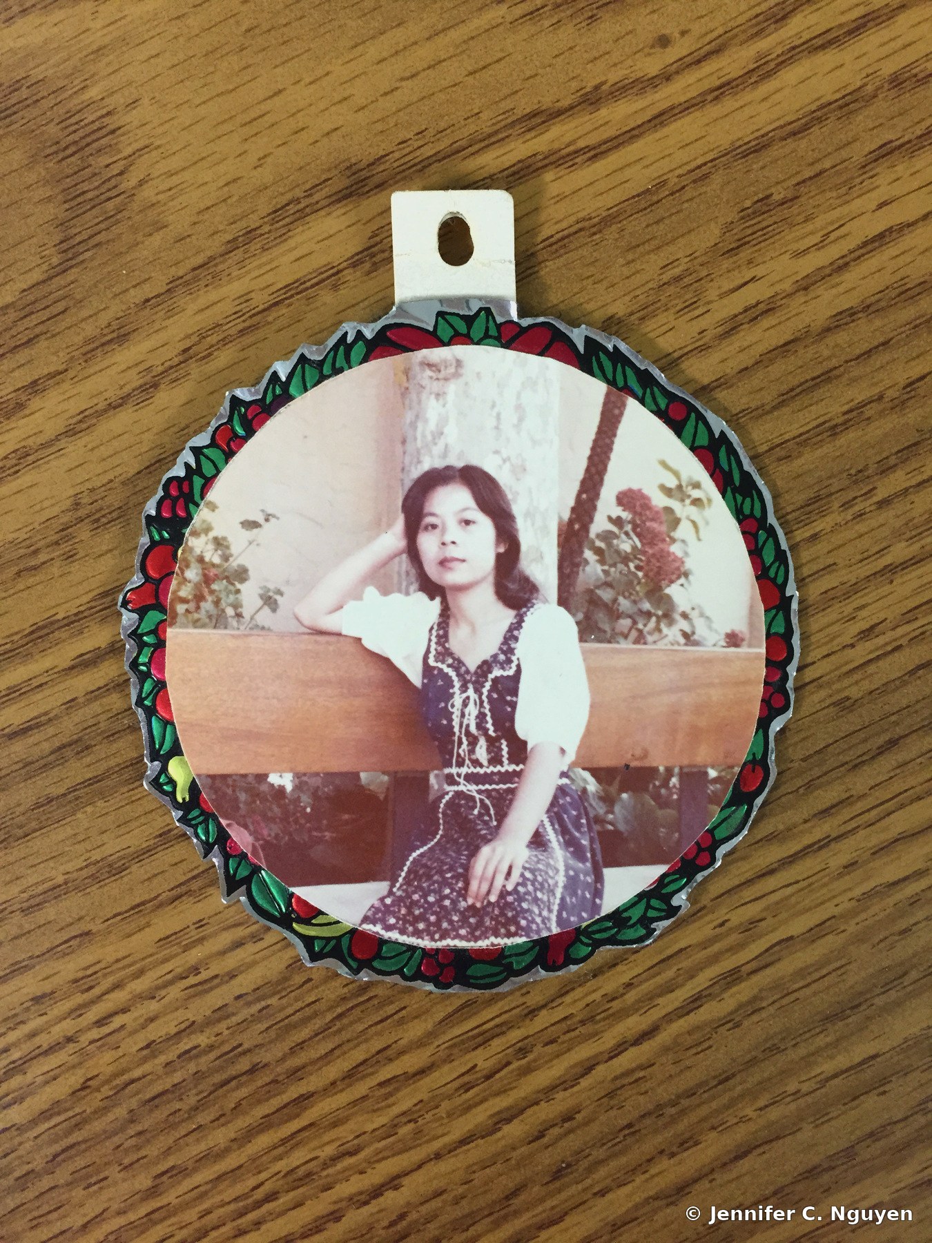
Original archival photograph of a young woman in a vintage dress, mounted inside a decorative circular photo ornament resting on a wood grain table
After — Restored
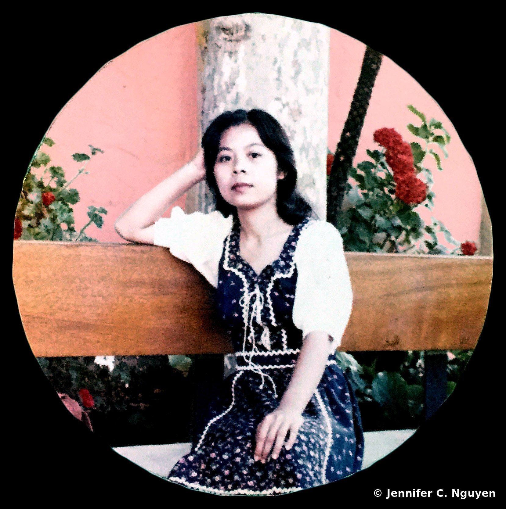
Restored version of the same photograph, isolated into a clean circular crop with corrected color, presented on a solid black backdrop
Before — Original
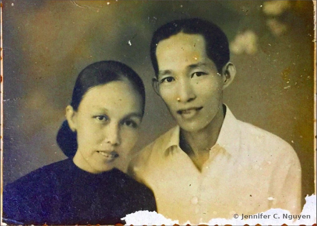
Original sepia-toned archival photograph of a man and woman posing closely together for a portrait, with torn, worn, and ragged edges along the borders of the print
After — Restored
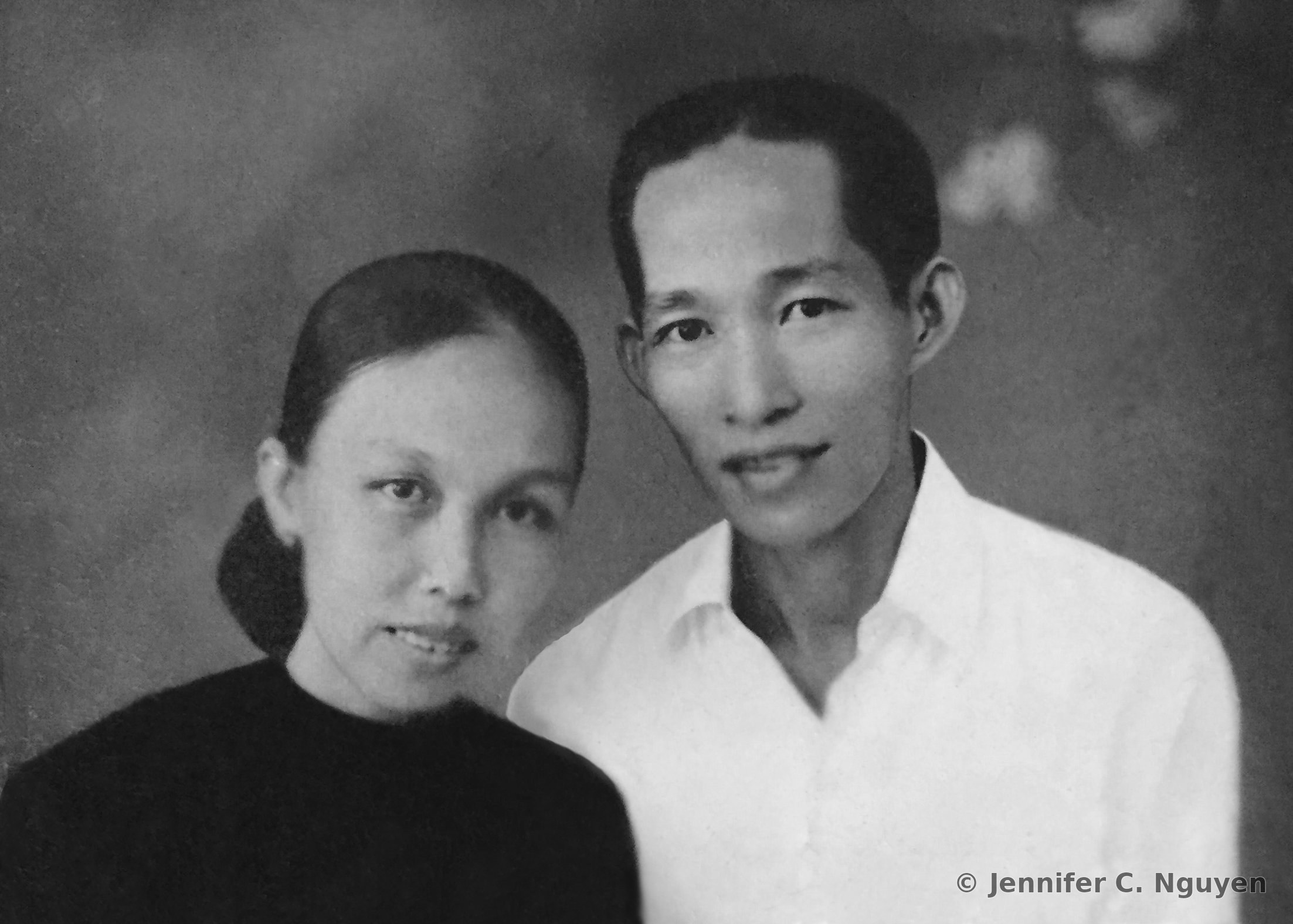
Digitally restored version of the same photograph, tears and surface damage repaired, dust and scratches removed, tone corrected to balance exposure across the frame, and cropped to remove the damaged borders

Typography & Poetry DesignOriginal Poem, Set & Composited in Photoshop
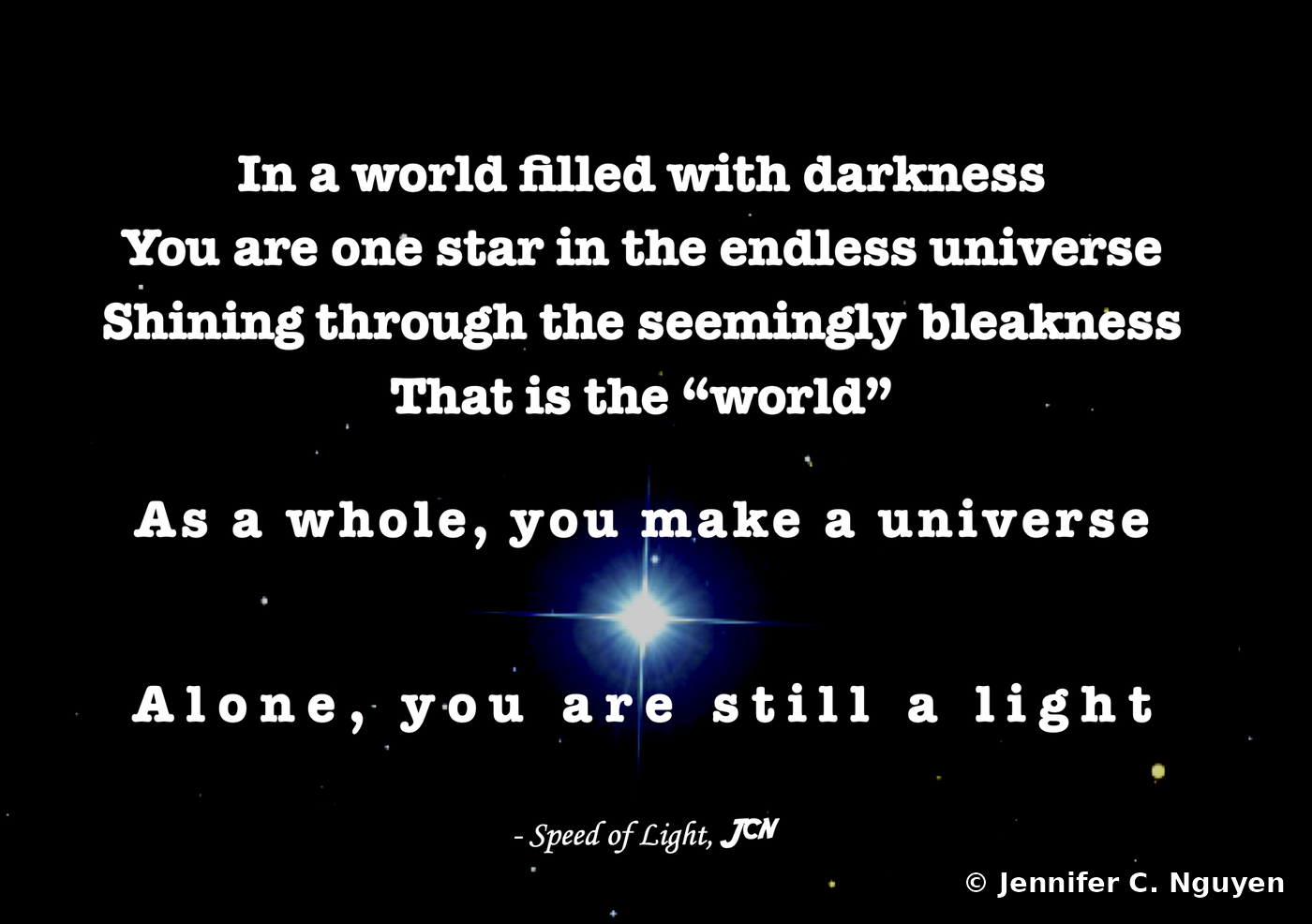
Original short poem titled Speed of Light set in bold white serif type over a starfield background, centered on a single bright star with a blue lens-flare glow, signed with the initials JCN

Infographic & Illustration Concept & Practice Pieces · Adobe Illustrator · Graduate Coursework
01
Illustrator Portfolio, Infographic & Instructional Design

A collection of infographic, instructional, and awareness pieces built entirely in Adobe Illustrator during graduate coursework, translating data, processes, and health information into clear, accessible visual communication.

Infographic DesignData VisualizationInstructional DesignIconography
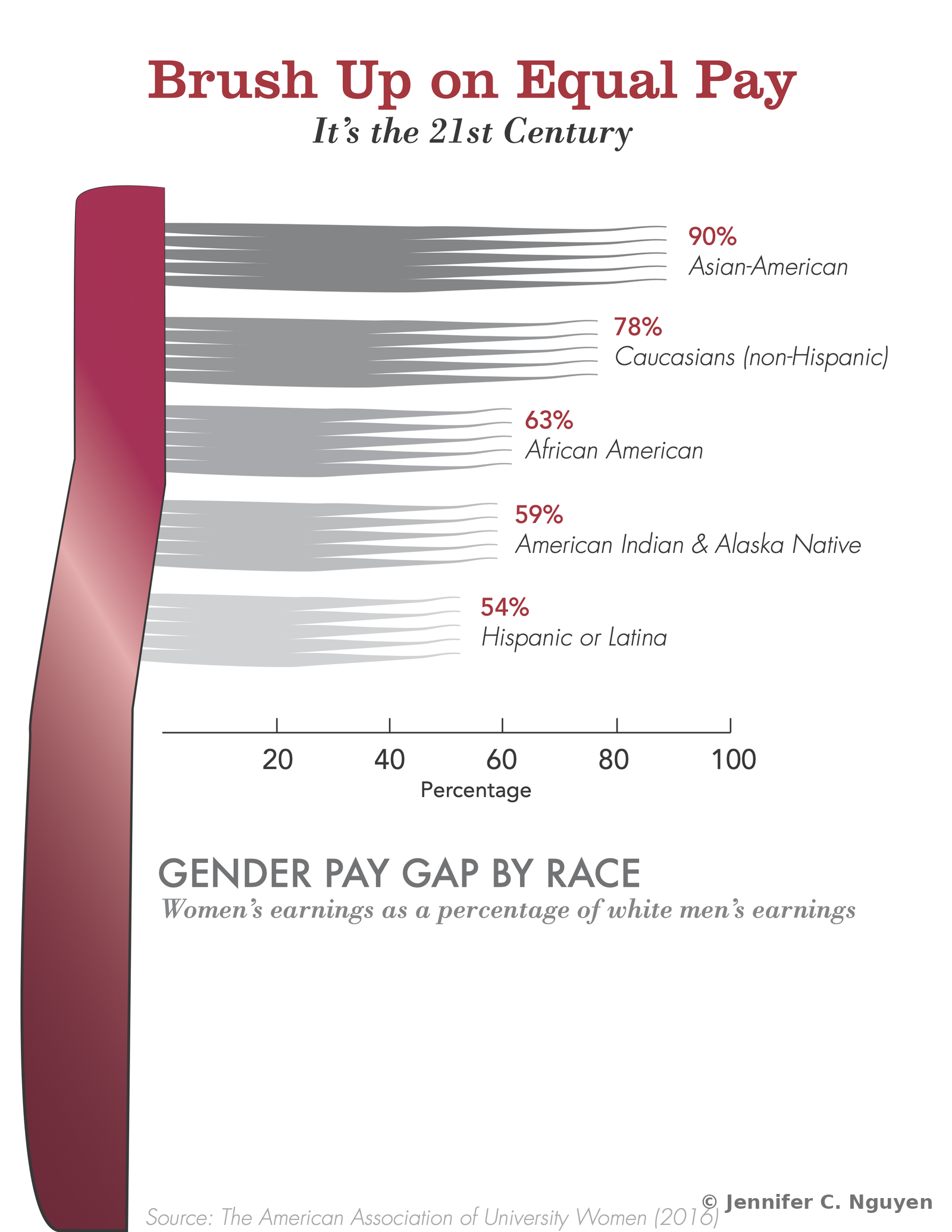
Data visualization infographic titled Brush Up on Equal Pay, showing five gradient bar streams representing women's earnings as a percentage of white men's earnings by race, listing Asian-American at 90 percent, Caucasians non-Hispanic at 78 percent, African American at 63 percent, American Indian and Alaska Native at 59 percent, and Hispanic or Latina at 54 percent, sourced from the American Association of University Women 2016
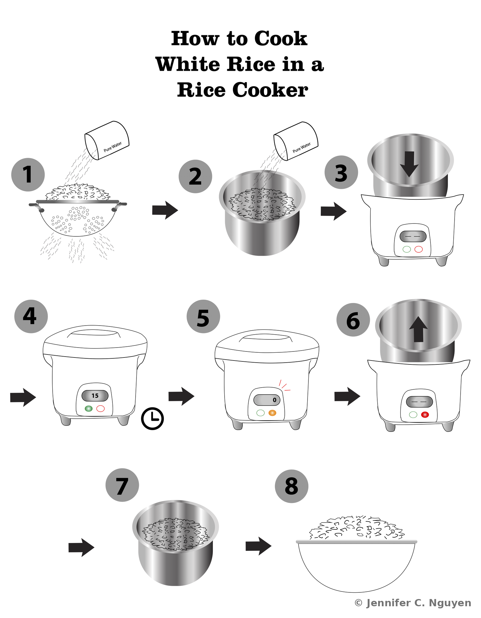
Eight-step instructional pictograph titled How to Cook White Rice in a Rice Cooker, illustrating rinsing the rice, adding water, placing the pot into the cooker, setting the timer, the cook cycle finishing, removing the pot, and serving the finished rice
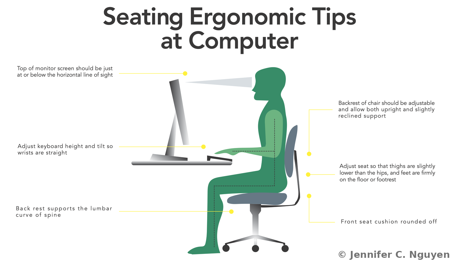
Ergonomic infographic titled Seating Ergonomic Tips at Computer, showing a green illustrated figure seated at a desk with labeled callouts for monitor height, keyboard tilt, chair backrest angle, seat depth, and lumbar support
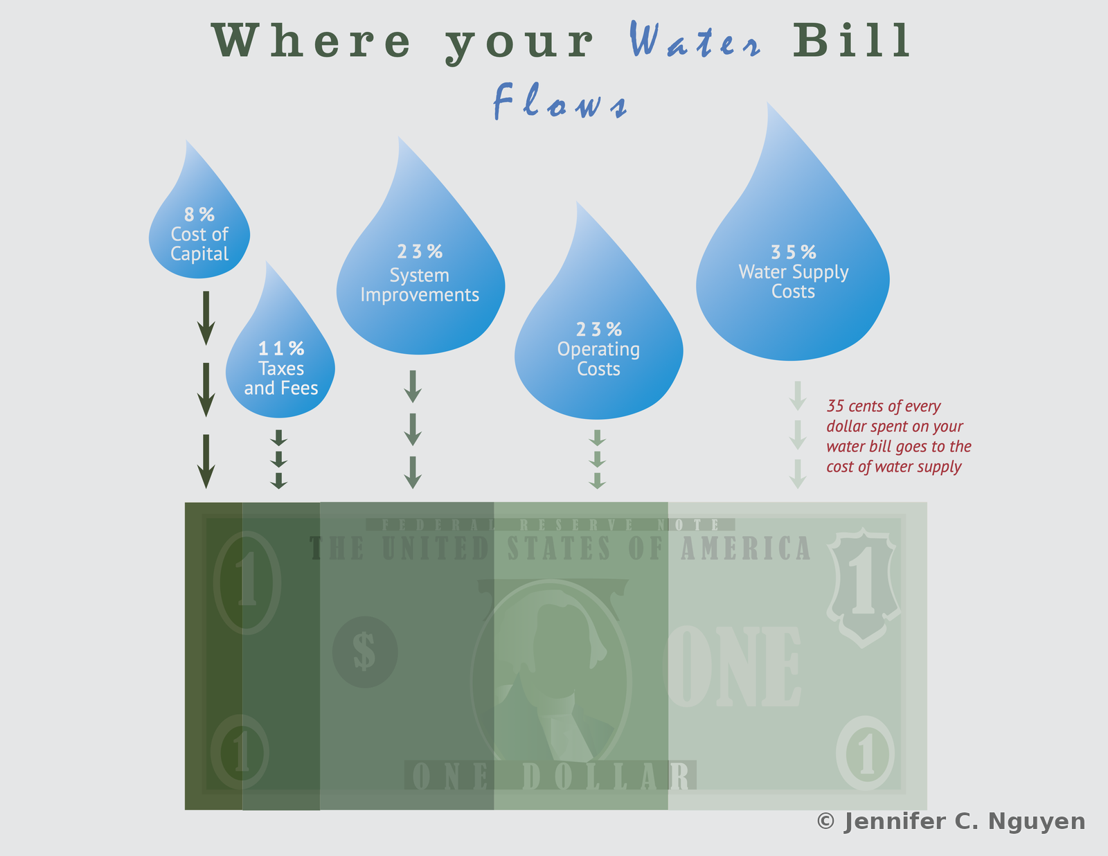
Infographic titled Where your Water Bill Flows, showing five blue water droplet icons sized by percentage for cost of capital, taxes and fees, system improvements, operating costs, and water supply costs, flowing down into a stylized one-dollar bill
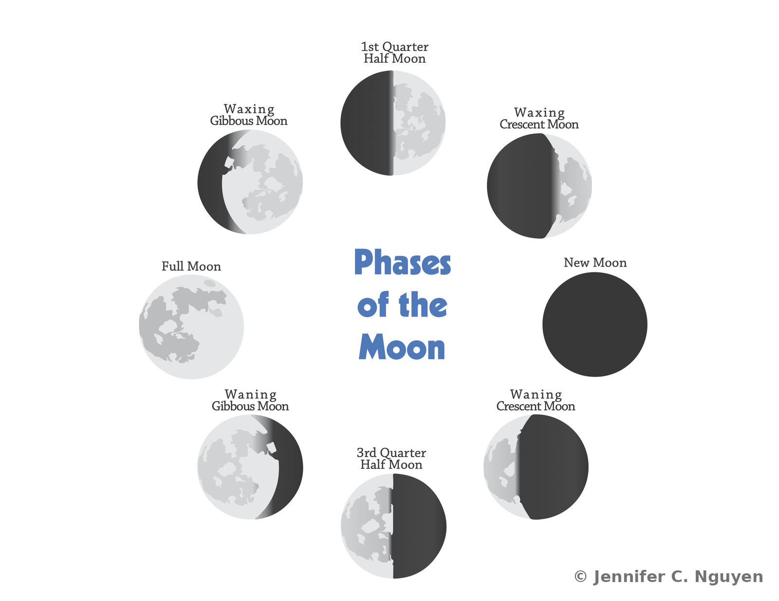
Educational diagram titled Phases of the Moon, showing eight labeled moon phase illustrations arranged in a circle around the title, including new moon, waxing crescent, first quarter half moon, waxing gibbous, full moon, waning gibbous, third quarter half moon, and waning crescent
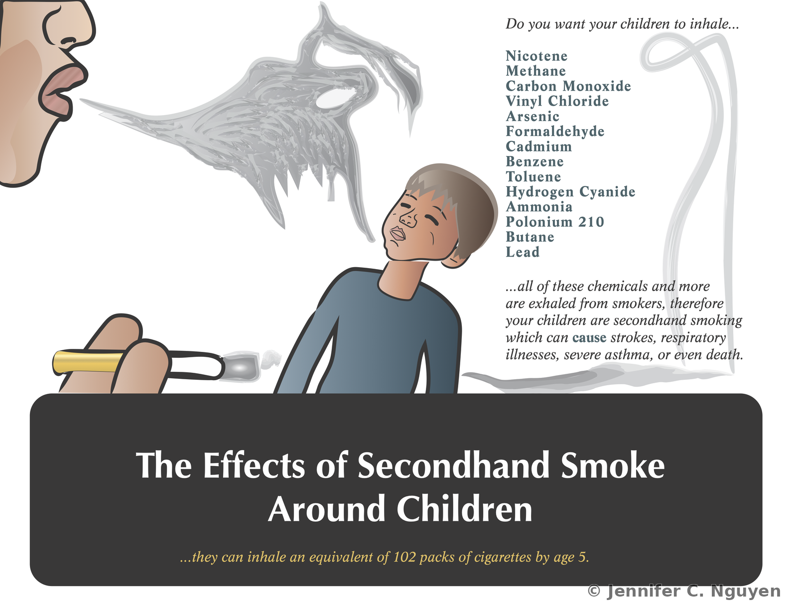
Health awareness poster titled The Effects of Secondhand Smoke Around Children, showing an illustrated adult exhaling smoke near a child, a list of chemicals found in cigarette smoke, and a statement that children can inhale the equivalent of 102 packs of cigarettes by age 5
02
Personal Brand Identity Exploration, Logo & Wordmark Concepts

A personal, non-client project built in Adobe Illustrator to explore potential branding for an instructional design practice. Includes monogram, icon, and wordmark studies across several naming and color directions, developed before settling on a final identity.

Logo DesignMonogramBrand ExplorationColor StudiesGraduate Coursework

JCN MonogramPortfolio Cover Concepts
Portfolio cover logo concept featuring a blue crescent-shaped checkmark forming interlocking J, C, and N letterforms, with the cursive script structional designs trailing off in a diagonal line to the upper right
Back cover version of the same monogram, showing the cursive word Jennifer above the interlocking J, C, and N checkmark ligature, with Nguyen in bold beside it and the diagonal accent line continuing to the upper right

Checkmark & Moon Icon SystemMonogram & Color Exploration
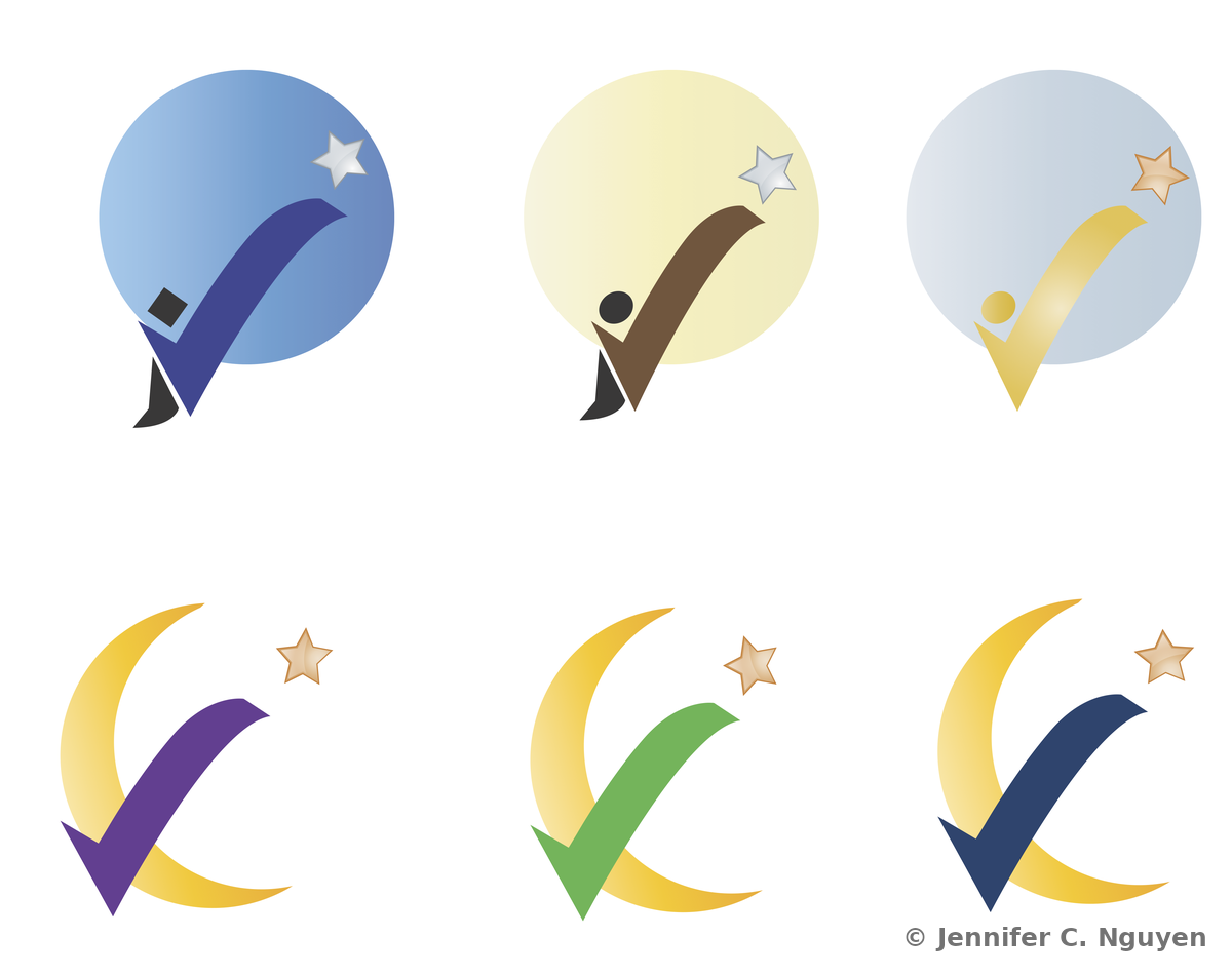
Grid of six icon concepts exploring a checkmark motif: three circular badges each pairing a colored checkmark with a small standing figure and star in blue, tan, and pale blue-gold colorways, and three crescent-moon-and-checkmark marks with a star accent in purple, green, and navy
Two colorway studies of an abstract J-shaped mark flanked by curved bracket lines, shown in navy and gray on top and red and brown below
Side-by-side size and color comparison of three CJN monogram variants: a maroon, yellow-green, and navy version with an iD mark, a navy and blue version paired with Structional Designs text, and a purple and blue version paired with Instructional Designs text

Dreamcatcher Wordmark SeriesTagline & Colorway Exploration
Teal and gray dreamcatcher peace-sign mark with feathers, surrounded by the curved text Catch the Dream and, in smaller script, instructional Technology Designs
Dreamcatcher peace-sign mark with feathers in purple, blue, and gold, topped with a small crown, above the wordmark See Jennifer Nguyen and the tagline Innovative Instructional Designs
Dreamcatcher peace-sign mark with feathers in a purple and blue color study, without accompanying text

Sea Otter Brand MarkColorway Exploration
Same sea otter brand mark and wordmark in a tan and red colorway
Same sea otter brand mark and wordmark in a blue and tan colorway
Same sea otter brand mark and wordmark in a teal and olive colorway
03
Birthday Word-Cloud Collages, Custom Typographic Portraits

A series of personal, non-client pieces built in Adobe Illustrator as birthday gifts for friends. Each one arranges descriptive words, shared memories, favorite media, and personal traits into the shape of the recipient's age, with a custom color palette and tagline.

TypographyWord Cloud DesignCustom IllustrationPersonal Project
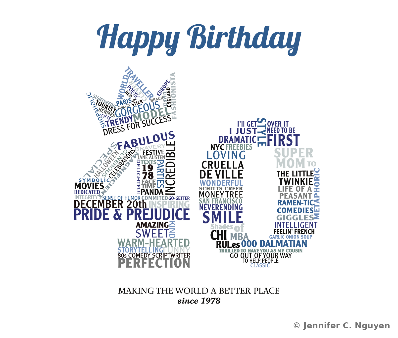
Birthday word-cloud portrait arranging descriptive words, favorite films, inside jokes, and personal traits into the shape of the number 40, topped with a Happy Birthday script header in blue and the tagline Making the World a Better Place since 1978
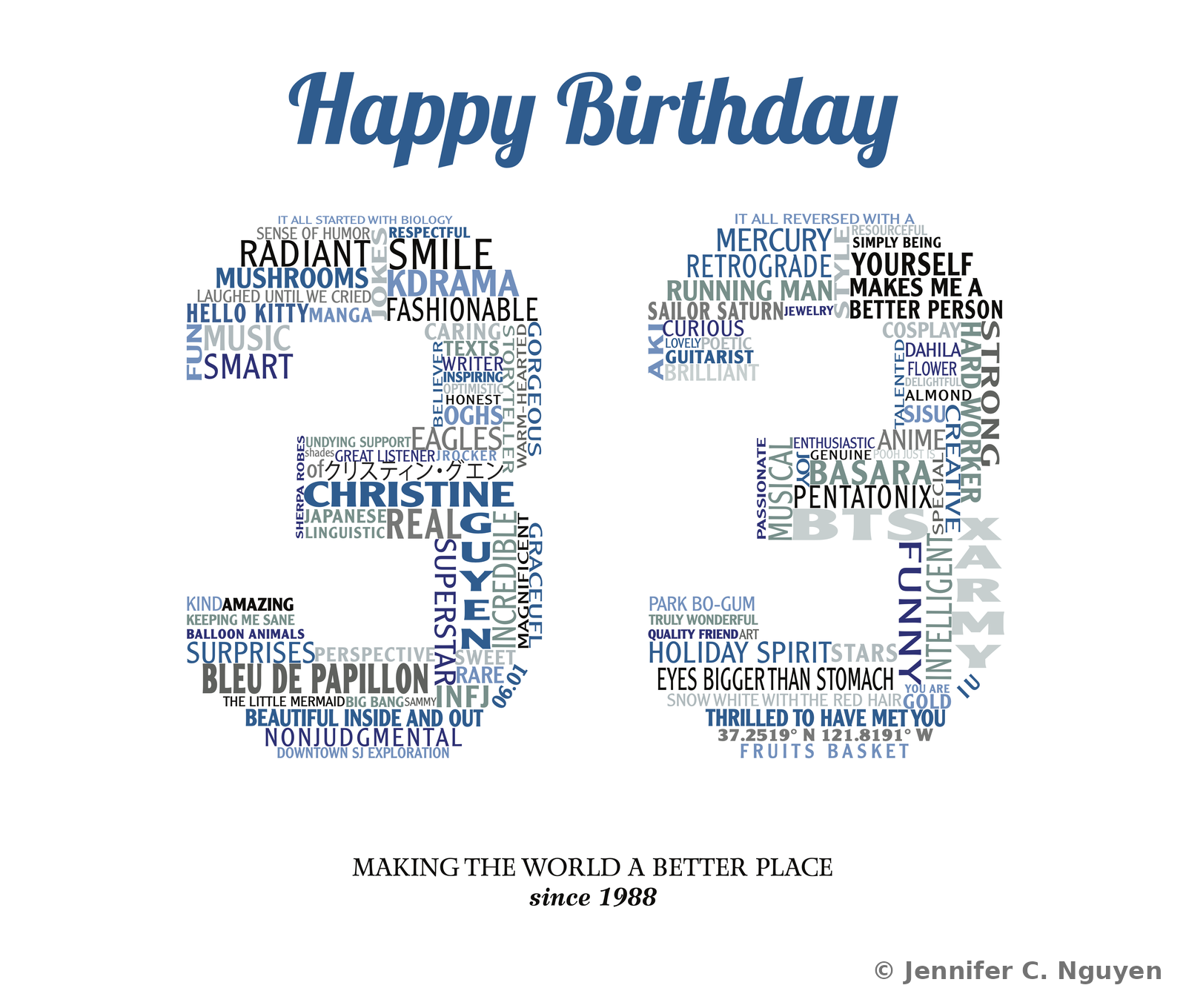
Birthday word-cloud portrait arranging descriptive words, favorite shows, and personal traits into the shape of the number 33, topped with a Happy Birthday script header in blue and the tagline Making the World a Better Place since 1988
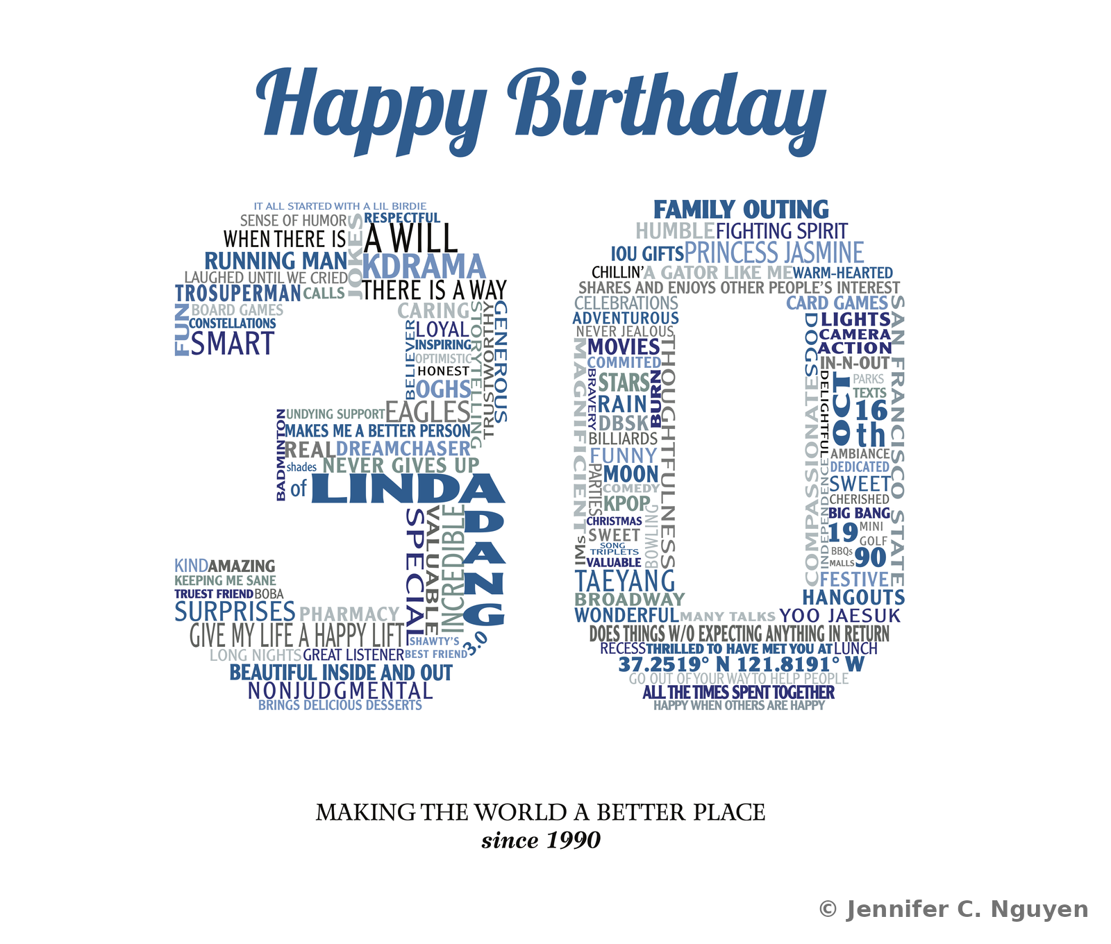
Birthday word-cloud portrait arranging descriptive words, favorite shows, and personal traits into the shape of the number 30, topped with a Happy Birthday script header in blue and the tagline Making the World a Better Place since 1990
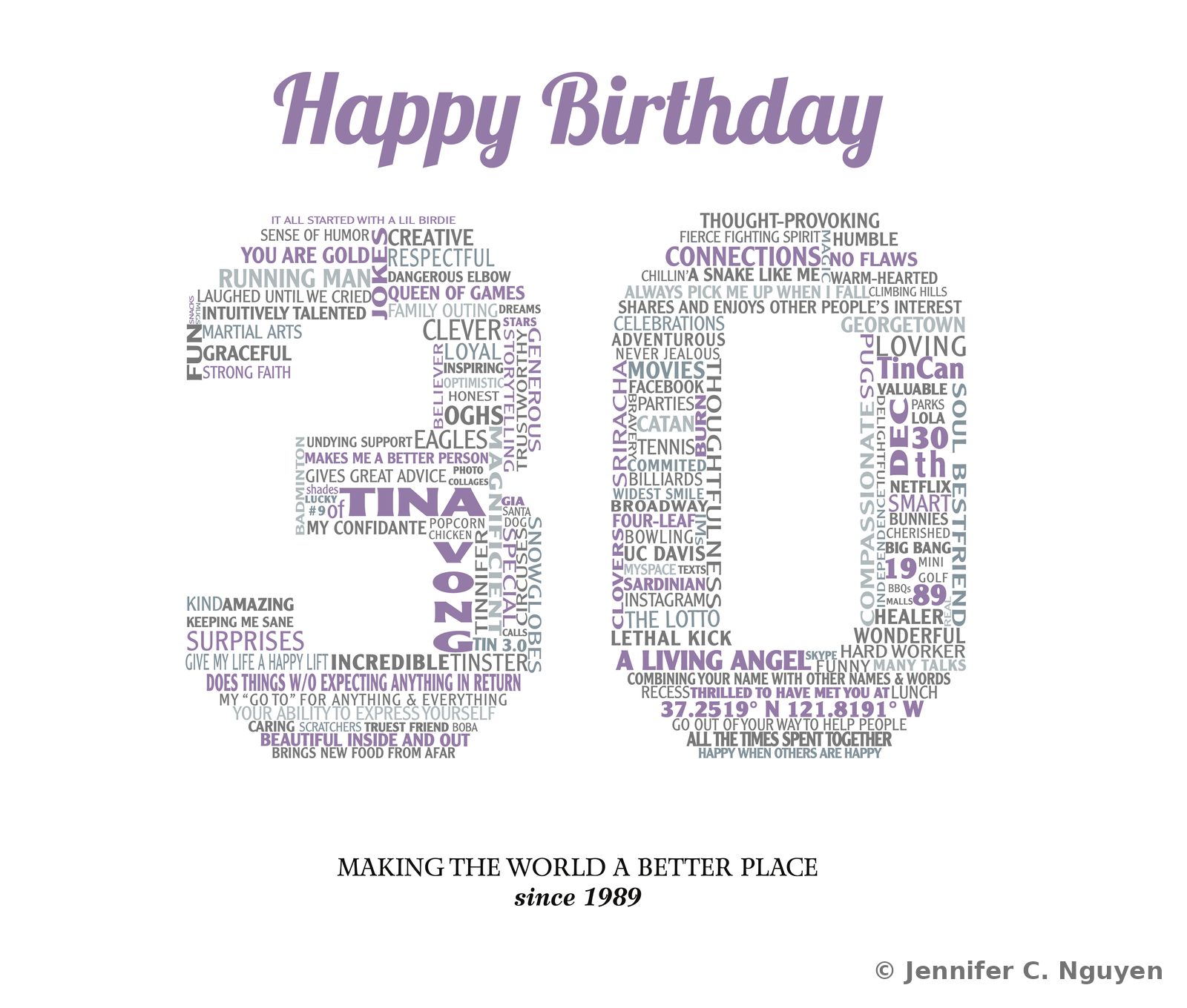
Birthday word-cloud portrait arranging descriptive words, favorite shows, and personal traits into the shape of the number 30, topped with a Happy Birthday script header in purple and the tagline Making the World a Better Place since 1989
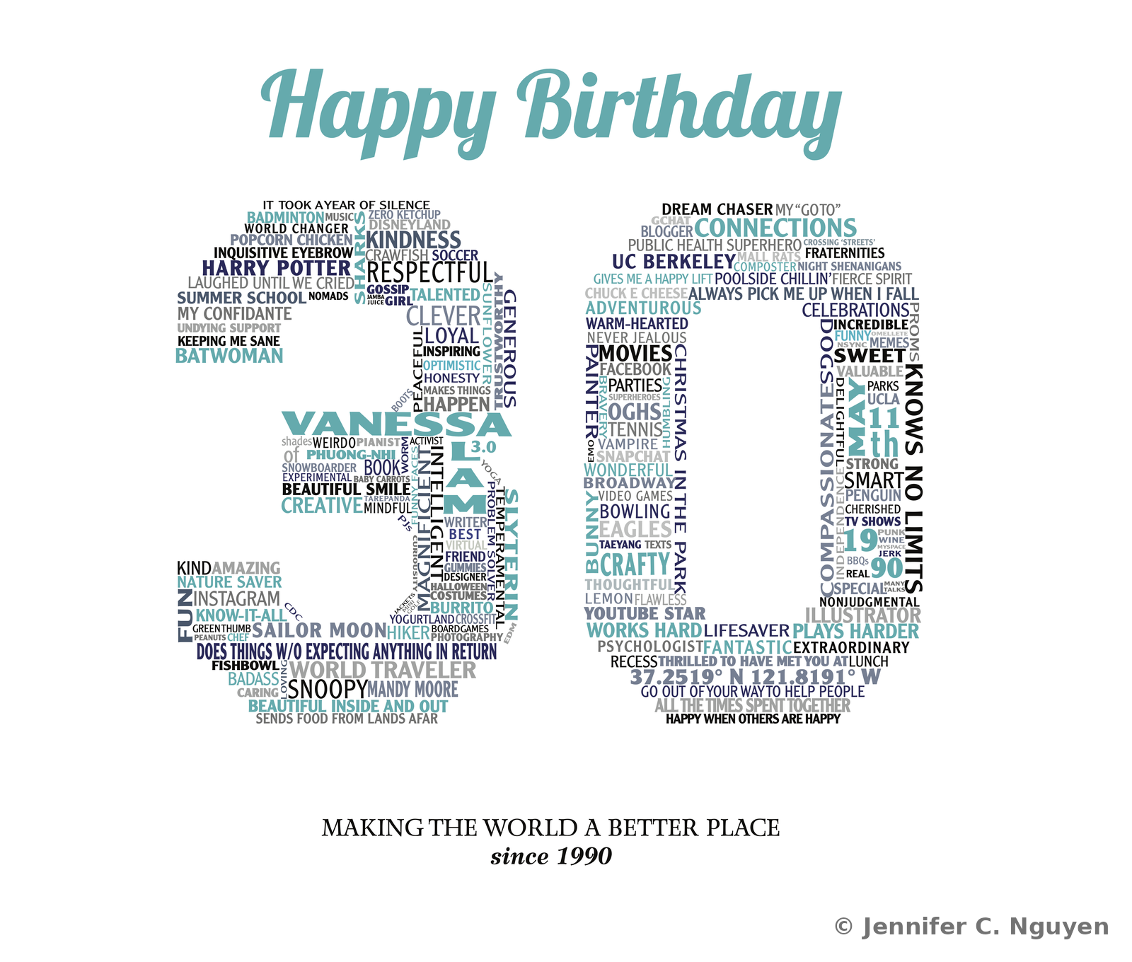
Birthday word-cloud portrait arranging descriptive words, favorite shows, and personal traits into the shape of the number 30, topped with a Happy Birthday script header in teal and the tagline Making the World a Better Place since 1990
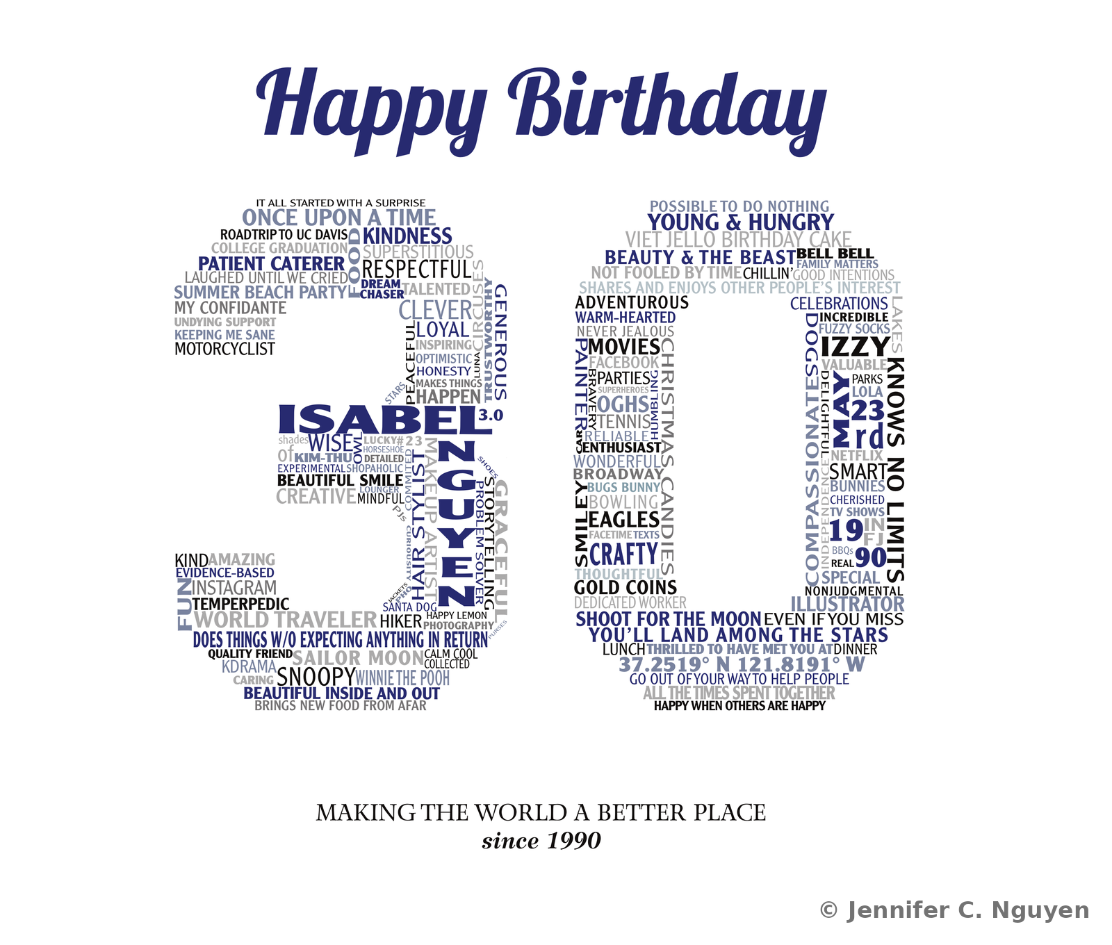
Birthday word-cloud portrait arranging descriptive words, favorite shows, and personal traits into the shape of the number 30, topped with a Happy Birthday script header in navy and the tagline Making the World a Better Place since 1990

Website & UX Design UX & Visual Design Exercise · Adobe Muse · Graduate Coursework

01
Eating Well, Website Redesign Concept

A graduate school design project reimagining select pages of EatingWell.com in Adobe Muse, built purely as a UX and visual design exercise, not a full site rebuild. Not affiliated with, endorsed by, or built for the real EatingWell brand. Early wireframes, original site screenshots, and the redesign concept are shown below for direct comparison, with a homepage that originally featured a rotating image carousel.

Full Site DesignAdobe MuseContent Architecture

WireframesEarly structural planning · Adobe Illustrator
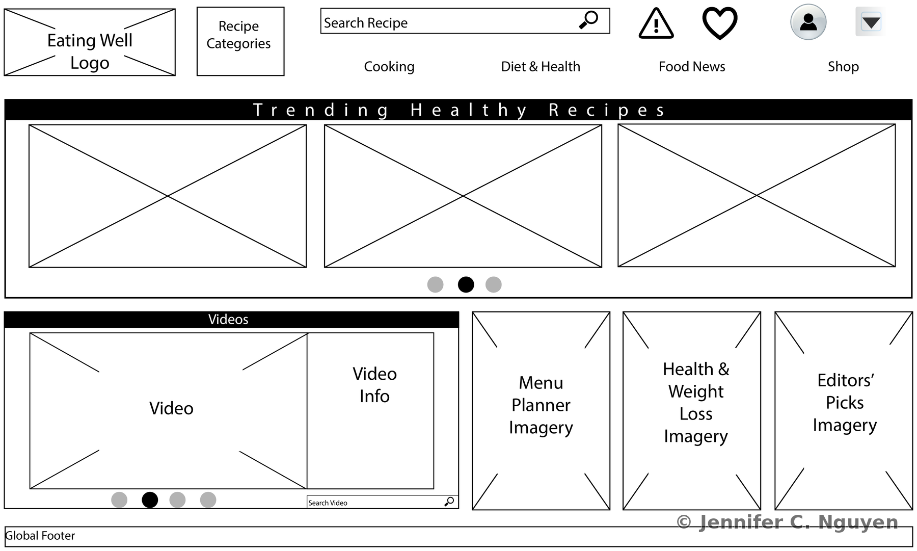
Black and white wireframe of the Eating Well homepage, showing placeholder boxes for a logo, recipe category dropdown, search bar, navigation links, a Trending Healthy Recipes carousel with three image placeholders, a Videos module, and three imagery blocks for Menu Planner, Health and Weight Loss, and Editors' Picks
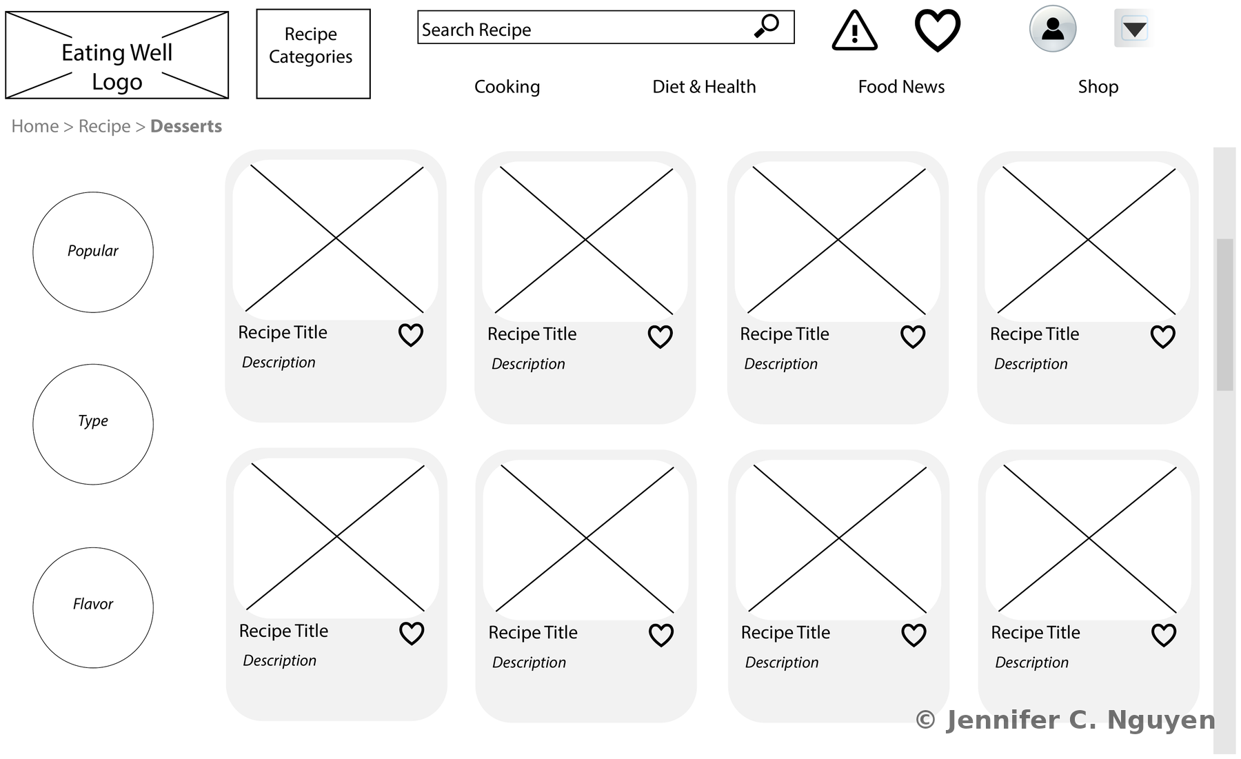
Black and white wireframe of the Eating Well Desserts recipe listing page, showing a breadcrumb trail reading Home, Recipe, Desserts, three circular filter options labeled Popular, Type, and Flavor, and a grid of eight recipe card placeholders each with an image box, recipe title, description, and heart icon

Before & After — Original Site vs. Redesign Concept
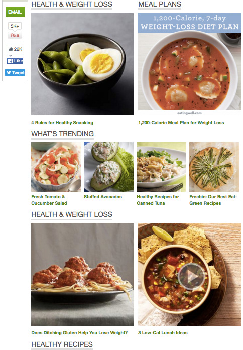
Before — Original
Screenshot of the real EatingWell.com homepage circa 2016, showing a white background layout with recipe photo thumbnails organized under headings including Health and Weight Loss, Meal Plans, and What's Trending, plus social share buttons on the leftOriginal Homepage — real eatingwell.com layout before redesign
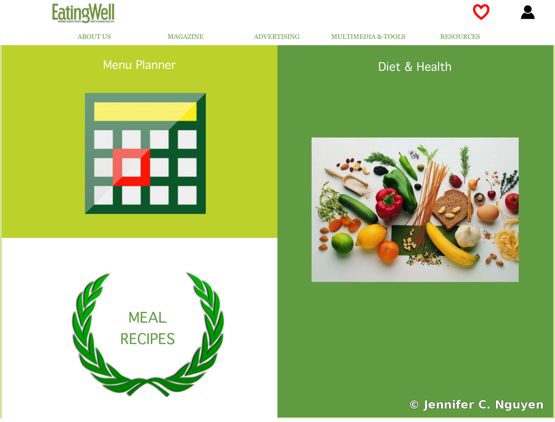
After — Redesign Concept
Homepage of the redesigned Eating Well website concept, showing the EatingWell logo, main navigation bar, and a green-toned grid of feature blocks including Menu Planner, Diet and Health, and Meal RecipesRedesigned Homepage — Adobe Muse concept
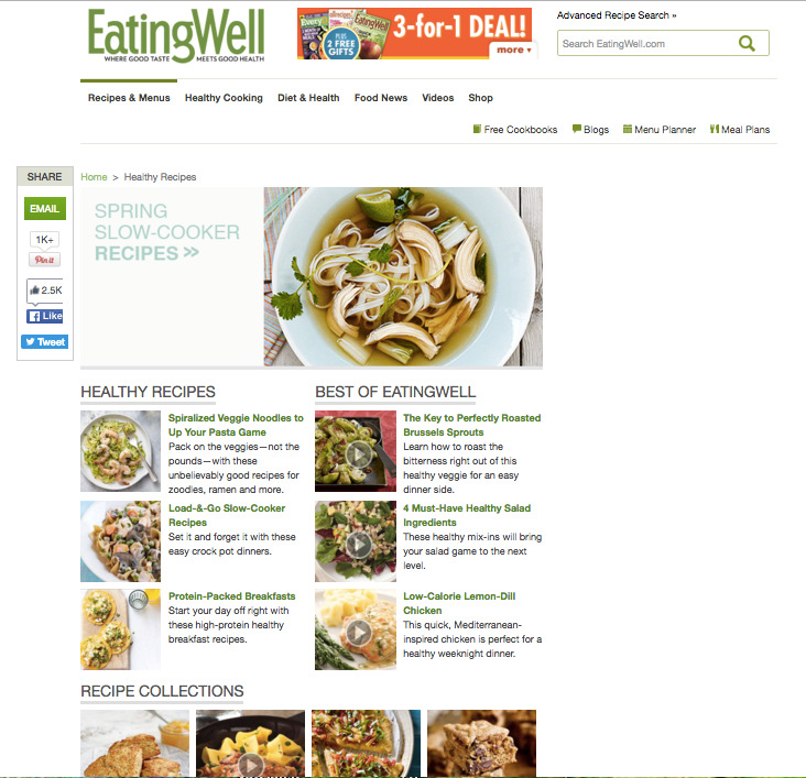
Before — Original
Screenshot of a real EatingWell.com recipe listing page circa 2016, titled Spring Slow-Cooker Recipes, showing a white background layout with recipe photo thumbnails organized under headings including Healthy Recipes, Best of EatingWell, and Recipe CollectionsOriginal Recipe Listing — real eatingwell.com layout before redesign
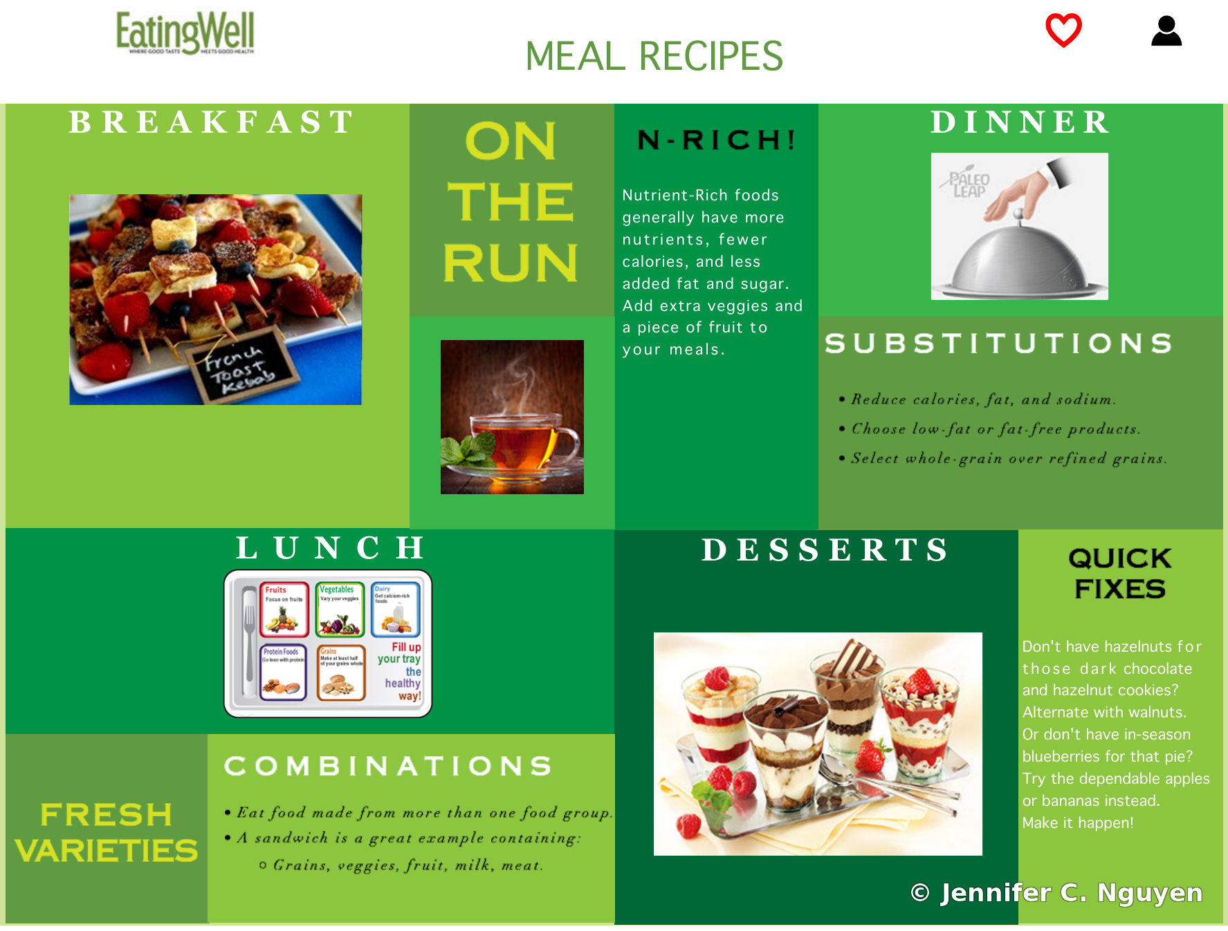
After — Redesign Concept
Meal Recipes page from the redesigned Eating Well website concept, showing a green-toned grid of meal categories including Breakfast, On the Run, Nutrient-Rich tips, Dinner, Substitutions, Lunch, Fresh Varieties, Combinations, Desserts, and Quick FixesRedesigned Meal Recipes — Adobe Muse concept
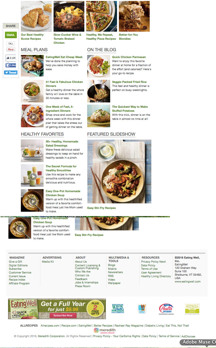
Before — Original
Stitched screenshot of a real EatingWell.com recipe listing page circa 2016, showing a white background layout with dessert and dinner recipe thumbnails organized under headings including Meal Plans, On the Blog, Healthy Favorites, and Featured Slideshow, continuing down into the site's footer navigationOriginal Recipe Listing, scrolled — real eatingwell.com layout before redesign
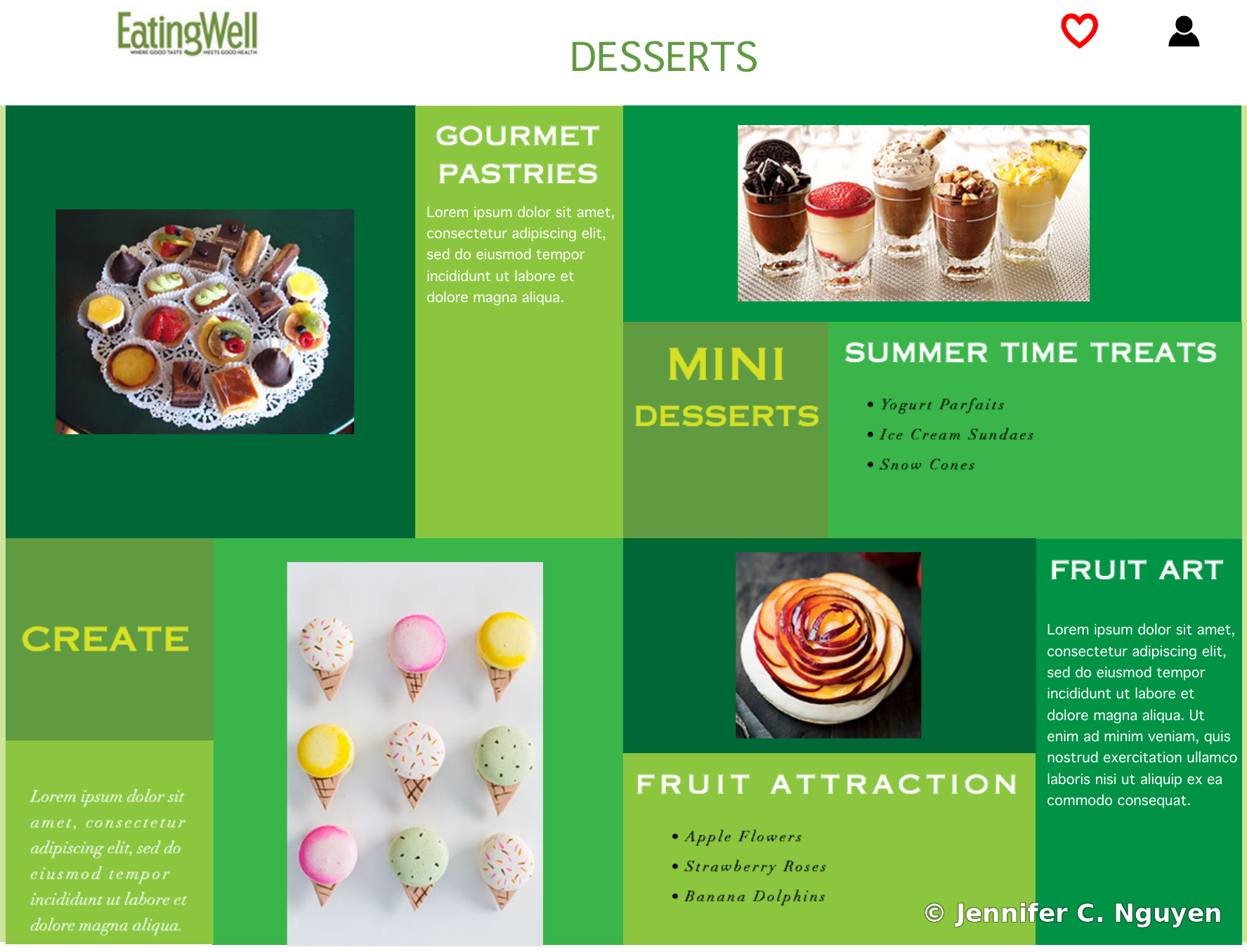
After — Redesign Concept
Desserts page from the redesigned Eating Well website concept, showing a green-toned grid of dessert categories including Gourmet Pastries, Mini Desserts, Summer Time Treats, Fruit Attraction, Fruit Art, and CreateRedesigned Desserts — Adobe Muse concept
More work available upon request. Additional brand, logo, and print design projects are available for review. Contact Jennifer directly to discuss your project needs.